Variable Types
There are several key data types, each of which you should report in a different way:
- Scalar variables (or measurement or continuous variables or numerous other possible monikers most of which mean exactly the same thing)—such as height, weight, the number of floors in a building, the number of patients in a hospital at a given time—are objects you can measure or count. Most researchers are comfortable using Likert scales (answers to questions beginning with “Please rate from 1 to x your feelings about…”) as continuous variables, although some equally reasonable researchers might and do argue that Likert data are ordinal or categorical rather than continuous. I think Likert scales are for the past, since we can now collect the same data using sliding scales—which are truly scalar—but that is another article.
- Categorical variables (or nominal variables)—such as race, gender, place of birth, color, type of medication, or the names of medical disorders—are objects you can count but that are more interesting because of the categories into which they fall.
- Binary variables—such as heads–tails, yes–no, or true–false—have only two possible values. Gender is no longer a binary variable since it contains least four legally recognized categories (male, female, nonbinary, other).
- Ordinal variables—such as school levels (first grade, second grade, third grade, etc.) or school performance (A through F)—have meaningful and equal or close to equal distances between them.
There are more complex variable types, but these are the ones we’ll most frequently discuss in these pages as they are the ones you will encounter most frequently.
How to Present Them
Statistical analysis is going through the greatest explosion of methodologies in its history. However, some conventions do exist, as discussed here.
Scalar Variables
Discuss scalar variables numerically using the mean, median, mode, and standard deviation. You can throw in the variance for good measure, but since the standard deviation is the square root of the variance, you don’t need to. Graph a scalar variable using a histogram or ridgeline plot. For instance, you might say, “Mean salary in a company in Great Britain was £30,950. The median salary was £18,888 with modes at £15,350 and £70,100. The standard deviation is wide at £14,113.23.” Having all the numbers can tell you a lot about how the data are distributed.
Read more about scalar variables at https://www.skillsyouneed.com/num/averages.html.
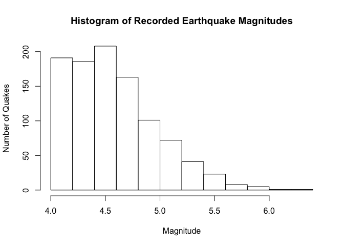
See examples of histograms below. One is of magnitudes for earthquakes that occured near Fiji since 1964. Magnitude is on the x axis and frequency, or number of earthquakes, is on the y axis. The left-most bar shows that approximately 190 earthquakes were of magnitude 4.0. Further along, you can see that the stronger the magnitude, the fewer the quakes at that magnitude.
shhh(library(datasets))
hist(quakes$mag,
     main = "Histogram of Recorded Earthquake Magnitudes",
     xlab = "Magnitude",
     ylab = "Number of Quakes")
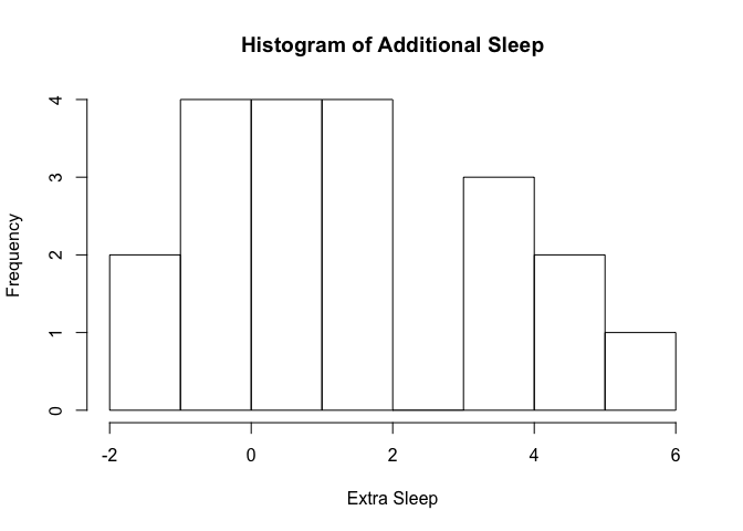
The second example is a histogram of how much additional sleep students got when they took an experimental drug. There were only 20 students in the data set, which may be why the extra sleep seems not to have been normally distributed. That may be the reason; there are other possibilities.
hist(sleep$extra,
     main = "Histogram of Additional Sleep",
     xlab = "Extra Sleep")
Better than histograms, in some people’s opinions (including mine) are density distribution plots, which are variously known as ridgeline plots or joyplots (although, due to copyright issues, we are not supposed to use “joyplots” any more).
library(ggridges)
library(ggplot2)
##
## Attaching package: 'ggplot2'
## The following object is masked from 'package:ggridges':
##
##     scale_discrete_manual
# basic example
ggplot(quakes, aes(x = 0, y = "mag", fill = "waternmelon")) +
  geom_density_ridges() +
  theme_ridges() +
  theme(legend.position = "none")
## Picking joint bandwidth of 0.226
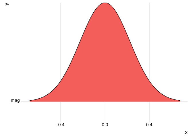
The distribution of quake magnitudes appears to be normal in a density plot. That’s because R standardizes the data before displaying it, and applies a smoothing algorithm to convey the basic shape of the distribution without getting caught up in subtleties.
Ridgeline plots can be a lot of fun. Check out this example:
# More complex example
ggplot(diamonds, aes(x = price, y = cut, fill = cut)) +
  geom_density_ridges() +
  theme_ridges() +
  theme(legend.position = "none")
## Picking joint bandwidth of 458
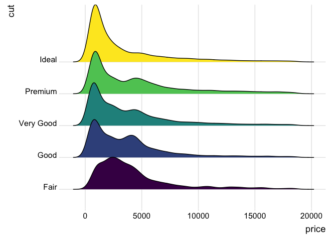
…but we get ahead of ourselves, as this second example shows the relationship between a scalar variable (price) and a categorical variable (cut).
Whether you use a histogram to see subtle differences in frequencies of each value or a ridgeline plot to get the basic idea of how the data look when they’re standardized is up to you. In some contexts you will want one method, in others, the other.
Categorical, Binary, and Ordinal Variables
Discuss categorical variables by stating the number of incidents of each category (e.g., 6 children ate apple sauce, 2 ate pear sauce, and 12 ate strawberry compote). The American Psychological Association editors in their handbook (affectionately referred to as “APA 6th”) recommend including the percentages, calculated as in this code chunk.
shhh(shh(library(tibble)))# It's a library, so shhh!
shhh(library(spatstat.utils))
shhh(shh(library(sjlabelled)))
apple_sauce <- 6
pear_sauce <- 2
strawberry_compote <- 12

# I'm using a lot of line breaks here to make sure it shows up the
# way it should once it's knitted
total_children <- apple_sauce +
      pear_sauce +
      strawberry_compote
pct_apple_sauce = percentage(apple_sauce /
                                   total_children)
pct_pear_sauce = percentage(pear_sauce /
                                  total_children)
pct_strawberry_compote = percentage(strawberry_compote /
                                          total_children)
pct_apple_sauce
## [1] "30%"
pct_pear_sauce
## [1] "10%"
pct_strawberry_compote
## [1] "60%"
paste("Total:",
      percentage((apple_sauce / total_children) +
                       (pear_sauce / total_children) +
                       (strawberry_compote / total_children)))
## [1] "Total: 100%"
Using R Markdown’s inline expression syntax, you can drop values straight into your text, like this:
     Of the `r total_children` children who participated in the study,
     `r apple_sauce` (`r pct_apple_sauce`) ate apple sauce,
     `r pear_sauce` (`r pct_pear_sauce`) ate pear sauce,
     and `r strawberry_compote` (`r pct_strawberry_compote`)
     ate strawberry compote.
The resulting text reads
     Of the 20 children who participated in the study, 6 (30%) ate  apple sauce,
     2 (10%) ate pear sauce, and 12 (60%) ate strawberry compote."
Just don’t give percentages without also giving the raw number of data points you have. It matters rather a lot if someone tells you they have 75% of a thing and they had 10,000 data points, but it would be cheating to imply that our 75% (which represents 3 data points out of 4) is equally meaningful.
[Oh, And if you want to know how I got backticks to show up in the text without any errors, see T. Hovorka’s article How to Show R Inline Code Blocks in R Markdown.]
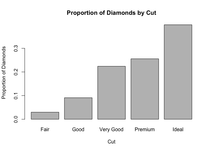
Graphically, the bar plot is the go-to representation for categorical variables.
barplot(table(diamonds$cut), main = "Frequency of Diamonds by Cut", ylab = "Number of Diamonds", xlab = "Cut") # or

barplot(prop.table(table(diamonds$cut)), main = "Proportion of Diamonds by Cut", ylab = "Proportion of Diamonds", xlab = "Cut")
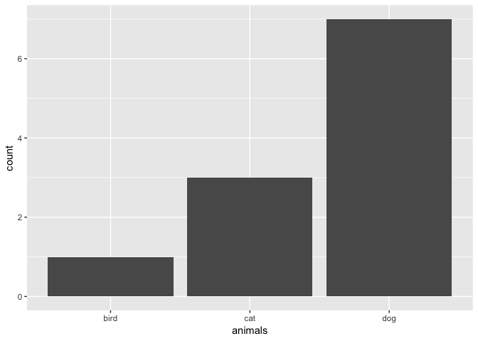
You can do the same thing using the ggplot2 package:
animals <- c("cat", "dog",  "dog", "dog", "dog", "dog", "dog", "dog", "cat", "cat", "bird")

library(ggplot2)
# counts
ggplot(data.frame(animals), aes(x=animals)) +
  geom_bar()
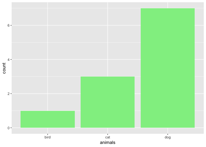
ggp <- ggplot(data.frame(animals), aes(x=animals))
# counts
ggp + geom_bar(fill = "lightgreen")
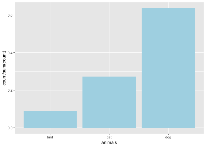
# proportion
ggp + geom_bar(fill = "lightblue",aes(y = ..count../sum(..count..)))
You can go on and on with ggplot2 adding more and more layers to the plot. You might start with a title in this example. See Joy Payton’s articles on ggplot2 here to find out how.