
Understanding Pearson’s r
In this article, we’re going to try to get a numerical and graphical intuition about Pearson’s r.
Karl Pearson developed the statistical measure now known as Pearson’s r, or the Pearson product-moment correlation coefficient, around the turn of the 20th century. Briefly stated, Pearson’s r measures the covariance of two variables in terms of their standard deviations. In other words, leaving aside the units and scale of the two variables, is growth in one variable consistently reflected in comparable increase or decrease in the other?
Let’s give an example. I’ll take advantage of this post to also do a bit of R and ggplot2 practice for those who want to follow along. I’ll create some “perfect” data, where y is completely predicted by x in a linear relationship. In my case, y increases a bit more than double with every increase in x. This will obviously result in a clearly linear relationship:
# get libraries we need
library(ggplot2)

# Create some perfect data.
# x grows in units of 1, y in units of 2.3.
perfect_fit <- data.frame(x=0:500, y=seq(from = 18.5, by = 2.3, length.out = 501))

# get a sample of our perfect data
data <- perfect_fit[sample(1:501, 30),]

# What does our data look like?
plot <- ggplot(data, aes(x,y)) +
        geom_point() +
        coord_fixed(ratio = 1)
plot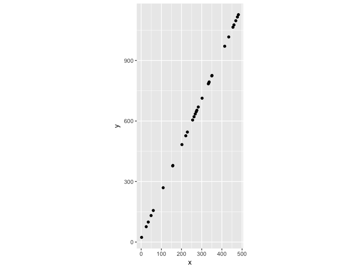
We can eyeball the slope to see that the line passing through these points has a slope of 2.3. But what is the relationship when we take into account that our two variables have different scales? We could replot this based on the z-score of each data point – how many standard deviations this point is from the mean of x and the mean of y:
# What if we wanted to plot in different units, like z-score
# (number of standard deviations from the mean)?
sd_x <- sd(data$x)
sd_y <- sd(data$y)
mean_x <- mean(data$x)
mean_y <- mean(data$y)

# What does our z-score scaled data look like?
data_scaled <- data.frame(x = (data$x-mean_x)/sd_x,
                          y = (data$y-mean_y)/sd_y)
plot <- ggplot(data_scaled, aes(x,y)) +
  geom_point()  +
  coord_fixed(ratio = 1)
plot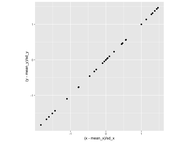
Here we see that with every standard deviation increase in x, there is a corresponding standard deviation increase in y. The slope of this line is 1:
> coefficients(lm(y~x, data_scaled))
  (Intercept)             x
-1.520235e-16  1.000000e+00
The slope is the same as our Pearson’s r:
> cor(data$x, data$y)
[1] 1
Since we scaled by z-indices (number of standard deviations) in order to get the correlation, it follows that we can work backwards to get the slope of the line of the actual model (using the original, unscaled variables) by multiplying Pearson’s r by the standard deviation of y divided by the standard deviation of x (our rise / run scale):
> cor(data$x, data$y) * (sd_y/sd_x)
[1] 2.3

> coefficients(lm(y~x, data))
(Intercept)           x
       18.5         2.3
What if we have a (more realistic) dataset that has some errors added to it? Try running the following and you’ll see that the slope of the linear model going through the scaled-by-z-index data is the same as the Pearson’s R:
# Let's do less-than-perfect-fit.

errors <- sample(seq(-250,250, by = 0.5), 501, replace=TRUE)


# Create some imperfect data.
# x grows in units of 1, y in units of 2.3.
imperfect_fit <- data.frame(x=0:500,
                            y=seq(from = 18.5, by = 2.3, length.out = 501) +
                              errors)

# get a sample of our imperfect data
imperfect_data <- imperfect_fit[sample(1:501, 30),]

# What does our data look like?
plot <- ggplot(imperfect_data, aes(x,y)) +
  geom_point() +
  coord_fixed(ratio = 1)
plot

# What if we wanted to plot in different units, like z-score
# (number of standard deviations from the mean)?
sd_imperfect_x <- sd(imperfect_data$x)
sd_imperfect_y <- sd(imperfect_data$y)
mean_imperfect_x <- mean(imperfect_data$x)
mean_imperfect_y <- mean(imperfect_data$y)

# What does our z-score scaled data look like?

imperfect_data_scaled <- data.frame(x = (imperfect_data$x-mean_imperfect_x)/sd_imperfect_x,
                          y = (imperfect_data$y-mean_imperfect_y)/sd_imperfect_y)
plot <- ggplot(imperfect_data_scaled, aes(x,y)) +
  geom_point()  +
  coord_fixed(ratio = 1)
plot

# What's the slope of this line?
coefficients(lm(y~x, imperfect_data_scaled))

# What's the pearson's r?
cor(imperfect_data$x, imperfect_data$y)
Pearson’s r is therefore a measure of how perfectly linear or inversely linear (1, -1) the change in two variables are, when considered in terms of their standard deviations (this scaling means that r means the same thing regardless of the scale of your variables). The relationship between Pearson’s r and the slope of your line in the model of your two variables is fairly straightforward.
Hopefully this gives you a bit more geometric intuition of the importance of Pearson’s r and how it relates to linear modeling!