
R 4 Beginners Chapter 4 - Data Visualization with ggplot2, Part II
R 4 Beginners
An exploration of data science as taught in R for Data Science by Hadley Wickham and Garrett Grolemund. This blog is meant to be a helpful addition to your own journey through the book. No prior programming experience necessary!
Chapter 4: Data Visualization with ggplot2, Part II
In the previous chapter, we began looking at data visualization with ggplot2, learning how to create plots with a variety of geometric objects, or “geoms,” and how to alter the look of our plots with aesthetic mappings. Next, we’ll discuss some other aspects of ggplot2 that can allow us to make more sophisticated plots and charts: statistical transformations, changing plot labels, position adjustments, and coordinate systems.
The ggplot2 cheatsheet mentioned in the previous chapter will be useful again here!
Statistical Transformations
There is one argument that every geometric function takes but that we haven’t discussed yet: stat, short for “statistical transformation.” We haven’t needed to talk about it yet because the default stat for geom_point is “identity”, which means that the raw data are used without transformation. However, this is not the default for all geoms! One example is a bar graph:
ggplot(data = diamonds) +
  geom_bar(mapping = aes(x = clarity))
You should see something like this:
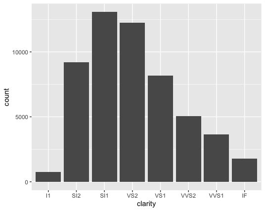
You should notice that we didn’t map a variable to the y axis in the code, but the y axis in the plot is count (which doesn’t appear in the diamonds dataset). This is because the default stat for geom_bar is count. Practically, this means that R calculates the number of observations (the number of rows in a tidy dataset) in each group using stat_count() and plots them on the y axis.
In fact, you could also just use stat_count() instead of geom_bar() and the plot will look exactly the same! Geoms and stats are paired- each geom has a default stat, each stat has a default geom. Which you choose to use will depend on what you’re trying to emphasize in your code. stat_count() actually computes two new variables from our data: count, which we’ve already talked about, and prop, a group-wise proportion. count will be used by default, but if you wanted the y axis to show the count as a proportion of the total, you’d use this:
ggplot(data = diamonds) +
  geom_bar(mapping = aes(x = clarity, y = stat(prop), group = 1))
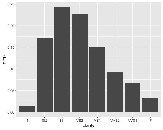
Since stat_count() computes the proportion we don’t need to change the stat argument, but we do need to specify that we want “prop” calculated from stat_count(), not a theoretical variable in our dataset that is called prop. So that’s why in the example above, we’re passing prop into the stat() function for y.
Also note that we needed to set another aesthetic, group, in the example above. Just for fun, try running the above code again, without group = 1. See how the height of every bar is 1.00? That’s because the default for the group aesthetic is to group by the x axis- of course, the proportion of each group is 1.00x of itself! To override this behavior, we need to set the group aesthetic to some constant. We used group = 1 above, but we also could have used 2, or 100, or “n”… as long as it isn’t a variable, it doesn’t matter.
You can also use geoms with stats that are not the default. One example of when this might be useful would be if we had a table in which the aggregate statistics had already been calculated:
| pet | number |
|---|---|
| dog | 123 |
| cat | 172 |
| fish | 36 |
| snake | 7 |
In later chapters, we will go through how to turn something like this (let’s call it pets) into a “tibble” in R, but for now you can imagine that if you tried to use geom_bar()or stat_count(), each bar would be 1! The numbers of each kind of pet are in the “number” column. So instead we could write something like this:
ggplot(data = pets) +
  geom_bar(mapping = aes(x = pet, y = number), stat = "identity")
However, that would not be the recommended way to make this plot. geom_col would be the preferred geom in this case, because geom_col uses stat = "identity" already, so there is less code to write:
ggplot(data = pets) +
  geom_col(mapping = aes(x = pet, y = number))
Plot labels
So far, the labels for the x and y axes of our plots have been whatever the variable is called in the dataset. However, this is not always the best practice. Often the variables we come across in datasets are abbreviations, or are not sufficiently descriptive, or don’t contain important units. In general, you should try to make sure your plot stands on it’s own, requiring minimal additional information for a viewer to understand it. Take for example one of the scatterplots we made in the previous chapter:
ggplot(data = mpg) +
  geom_point(mapping = aes(x = displ, y = hwy))
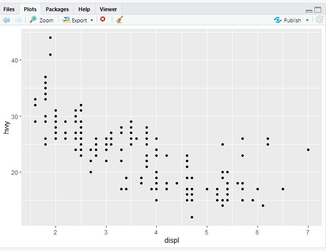
Now, if you think about it, would the average person unfamiliar with the mpg dataset know what the label “displ” refers to? Or “hwy”? Probably not. That’s where labs() comes in handy. Try running this code:
ggplot(data = mpg) +
  geom_point(mapping = aes(x = displ, y = hwy))+
  labs(x = "Engine displacement (liters)", y = "Highway MPG")
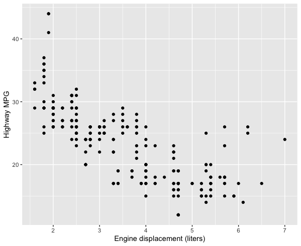
You can also add titles, subtitles, captions, and tags.
Position adjustments
Remember when we were talking about scatterplots and we mapped x, y, and then color to a third variable? You can do the same thing with bar charts (though we’ll use the fill aesthetic rather than color- try both and see why):
ggplot(data = diamonds) +
  geom_bar(mapping = aes(x = clarity, fill = cut))
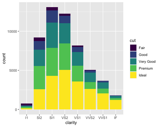
As you can see here, a neat thing happens when you map the “fill” aesthetic to a variable- each bar is now stacked, with the different colors representing the various values of cut. Essentially, each bar now represents combinations of clarity and cut. You could also state this explicitly like this:
ggplot(data = diamonds) +
  geom_bar(mapping = aes(x = clarity, fill = cut), position = "stack")
However, this stacking is not the only way that this kind of combination can be visualized- it’s only the default. You can change it by changing the position argument. position can take a few different values:
-
"fill"- This is different than thefillaesthetic. Here, you’re basically setting each bar to the same height (1.00) and the color is representing the proportions across each group. With the above example with clarity and cut, it would look something like this:
-
"dodge"- Instead of stacking the single bar,position = "dodge"puts the various combinations (ofclarityandcut, in this case) in individual bars and places them next to each other: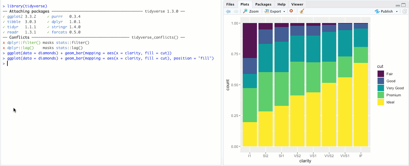
-
"identity"- This is the default for some geoms, likegeom_point(), but is less useful for bar graphs. Rather than stacking the blocks of different colors,position = "identity"just places the blocks wherever they naturally fall within the bar, basically as if they were all their own bars like in"dodge"but layered on top of each other. You can sort-of see the individual bars if you make them transparent by changing thealphaaesthetic: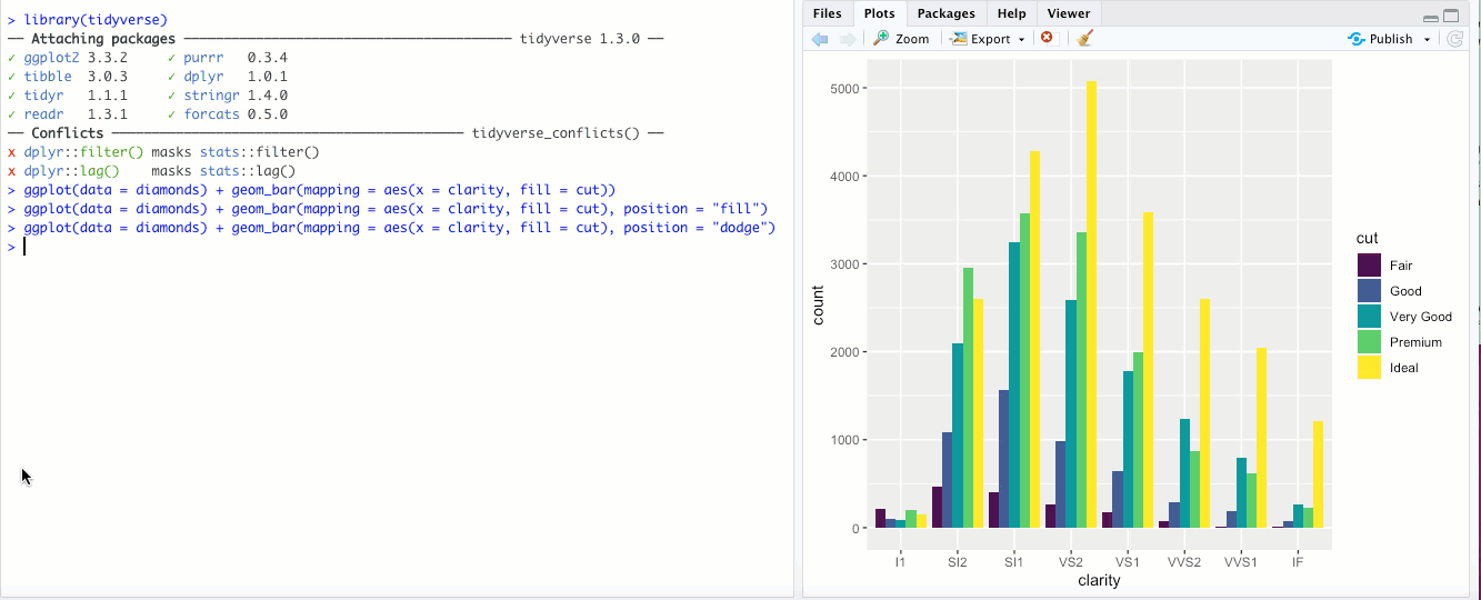 Honestly though, in my opinion it doesn’t look great and there are probably better ways to display your data.
 -
"jitter"- This option isn’t used for bar graphs, but can be super useful for scatterplots. In the last chapter, we looked at a scatter plot ofdisplvs.hwyin thempgdataset. If you add theposition = "jitter"parameter, check out what happens: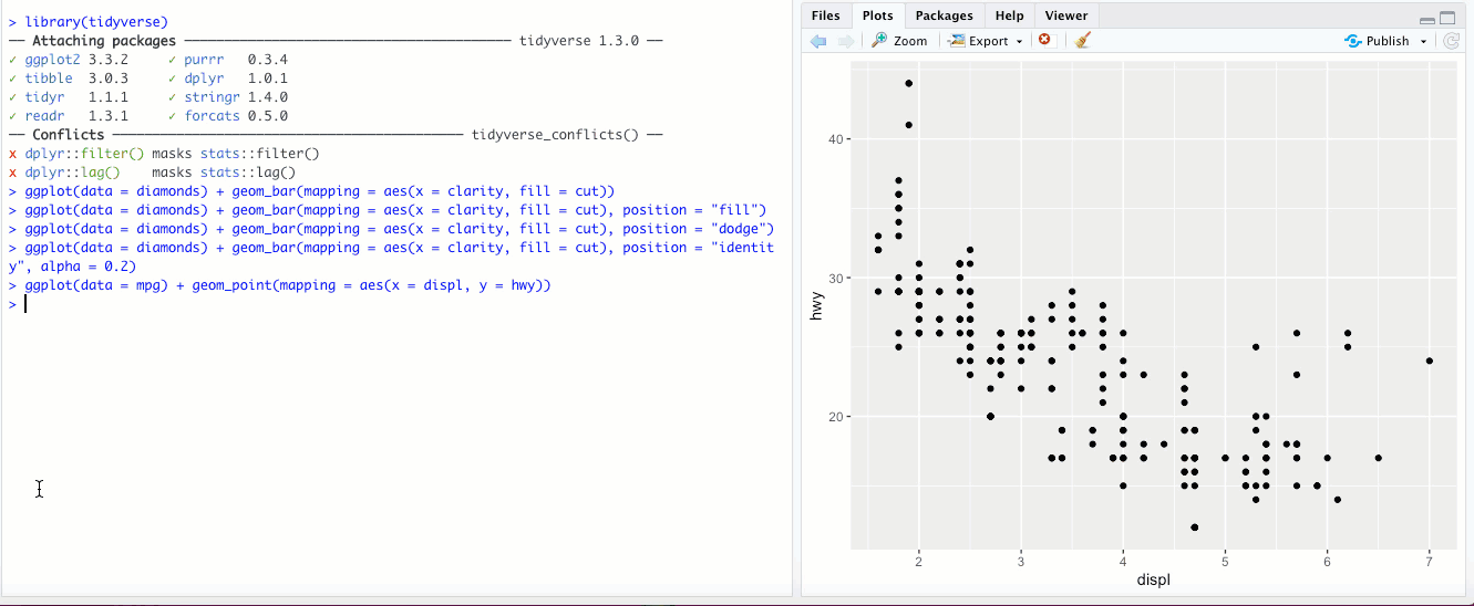 What
What position = "jitter"is doing behind the scenes is adding a tiny bit of randomness, a little “noise”, to the data. By definition, this means that the data are less accurate- however, at large scales, it reveals more about your data than the raw numbers would, because now fewer individual points appear right on top of each other. Check out Exercise 1 in section 3.8.1 of R4DS to see a particularly interesting example of where this might be useful. Finally, instead of usingposition = "jitter"withingeom_point(), there is another geom that does the same thing-geom_jitter(). Check out?geom_jitterfor more info.
Coordinate systems
Most plots that we’ll work with use a Cartesian coordinate system, in which the location of a data point can be described using it’s location along two perpendicular x and y axes (and sometimes a third z axis). However, this isn’t the only coordinate system you can use in ggplot2.
-
There might be times when it makes sense to “flip” your x and y axes- when categorical labels on the x axis are particularly long and overlap, or if you’re making a boxplot or bar chart and you feel it would look better oriented horizontally rather than vertically. The
coord_flip()geom flips your axes: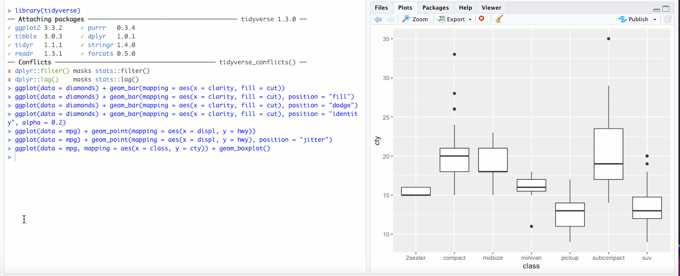
-
You can use
coord_quickmap()to give you the correct aspect ratio when you’re plotting map data. R4DS doesn’t go into plotting spatial data, but read up on it if you’re interested! -
You can plot data using a polar coordinate system using
coord_polar(). In a polar coordinate system, a data point is defined by the distance from a reference point (called the pole) and an angle relative to a reference direction (a ray). You can actually make some interesting pie charts by addingcoord_polar()to your bar plot:ggplot(data = diamonds) + geom_bar(mapping = aes(x = clarity, fill = cut)) + coord_polar()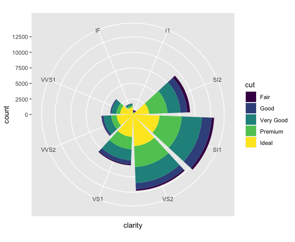 It looks cool, but I’d make sure that you’re adding actual value to your data analysis (better insight, clarity, etc.) when you make unusual plots like this, rather than doing it just because you can.
That’s it for data visualization! Seriously, bookmark that ggplot2 cheatsheet if you haven’t already and play around with different geoms and aesthetics. In the next chapter, we’ll start getting into data transformation.