
R 4 Beginners Chapter 3 - Data Visualization with ggplot2
R 4 Beginners
An exploration of data science as taught in R for Data Science by Hadley Wickham and Garrett Grolemund. This blog is meant to be a helpful addition to your own journey through the book. No prior programming experience necessary!
Chapter 3: Data Visualization with ggplot2, Part I
Introduction
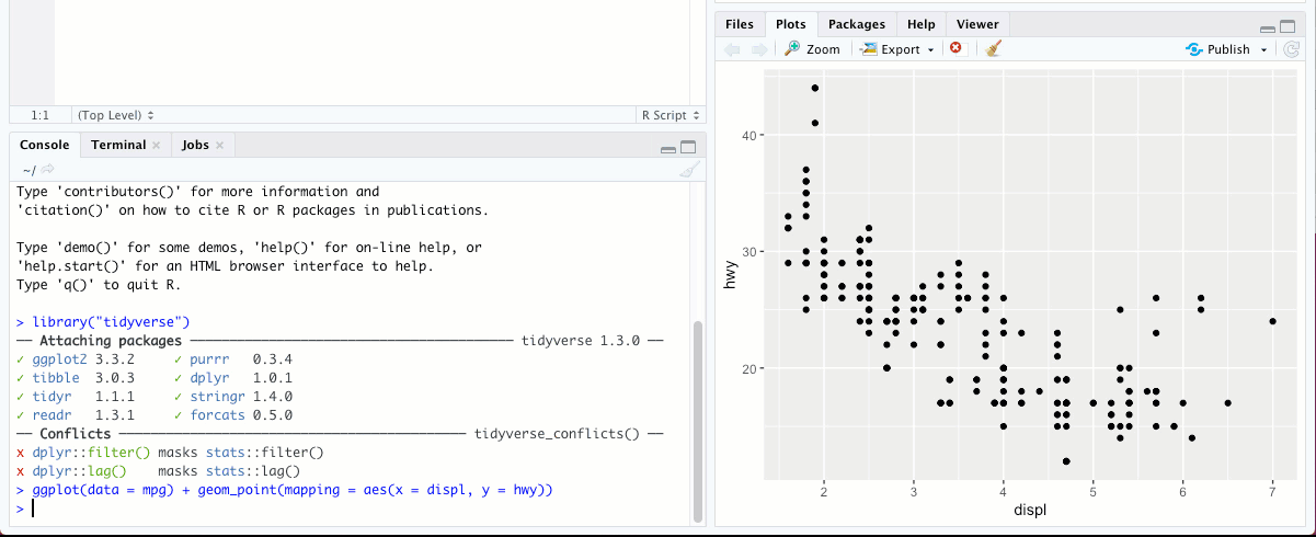
This week, we’re diving right into making plots with ggplot2, a package within the tidyverse that we installed in Chapter 1. Now, if you do a bit of googling about data visualization, you’ll quickly find that people have a LOT to say about it. There are lots of different philosophies, best practices, disagreements… it’s fascinating stuff, but I’m not going to even try to go into all that. Coming from a scientific background, I have my own opinions about what makes a “good” visual, and I’m sure you all have your own thoughts. The ggplot2 package is not the only way to approach data visualization in R, but it is certainly a popular one! The “gg” in ggplot2 actually refers to the “Grammar of Graphics”, and the authors of R4DS included a link to an interesting article about the theory of ggplot. If you’re interested, go ahead and give it a look! But for now, I’m going to focus on how to actually use ggplot2.
Syntax: Crafting your Plots
The syntax for creating a plot in ggplot2 may seen a bit complicated (unreadable?) at first, but we’ll go through and break it down piece by piece so that we know exactly what components are going into making our visualization.
This is the generic syntax that can be used to build any plot in ggplot2:
ggplot(data = <DATA>) +
  <GEOM_FUNCTION>(mapping = aes(<MAPPINGS>))
The first portion of the line of code above, ggplot(data = <DATA>), is indicating that we are going to create a plot of a specific set of data (anything in <> is something we specify depending on the plot we want to make- it’ll make more sense when we use real examples). We are calling the function ggplot(), which is a function in the ggplot2 package, whose argument is data. This sets up the basis for our plot, but it’s not enough yet to actually see anything- we still need to tell R what we want the plot to look like. The + means we’re adding a layer or element to our plot. After that, we specify the type of plot we want by called a “geometric function,” or a geom. For example, do we want a scatter plot? We’ll call the function geom_point. A bar graph? That’s geom_bar. Sensing a pattern? A geom function can take a variety of arguments related to how we want our plot to look, but the most important is mapping, which specifies how the actual data are displayed using aesthetic specifications (the “aes” part).
At this point, I think it’ll start to make more sense if we just dive in, so let’s visualize some actual data.
Visualizing Data with Geoms
Now we can start looking at data and asking some questions! While we will be learning to load and clean outside data in future chapters, for now we will take advantage of the fact that ggplot2 comes pre-loaded with some clean dataframes to practice with. I think about dataframes as kind of like spreadsheets or tables. They have two dimensions, with columns of variables and rows of observations. The first dataframe we’re working with is the mpg dataset. To see what it looks like, just type mpg into the console (don’t forgot to load the tidyverse first), and you’ll see this:
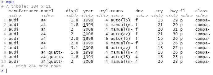
There are 11 variables, or fields, and 234 observations in this dataset. If you type ?mpg into the console, you can get some more information on each field.
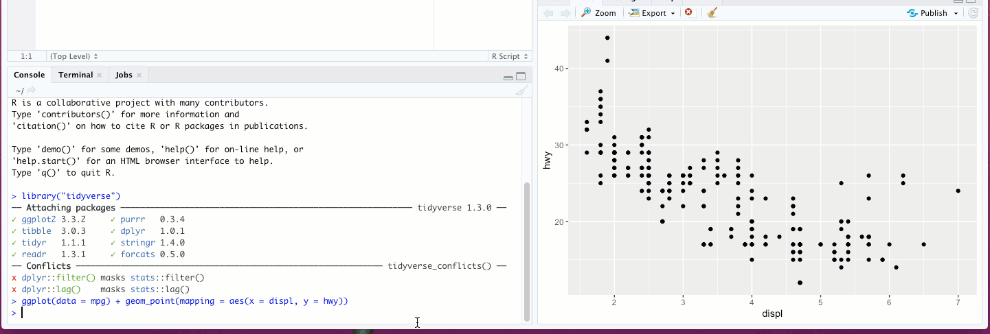
The first plot R4DS has us make begins with typing this line into our console:
ggplot(data = mpg) +
  geom_point(mapping = aes(x = displ, y = hwy))
Which shows us this scatterplot:
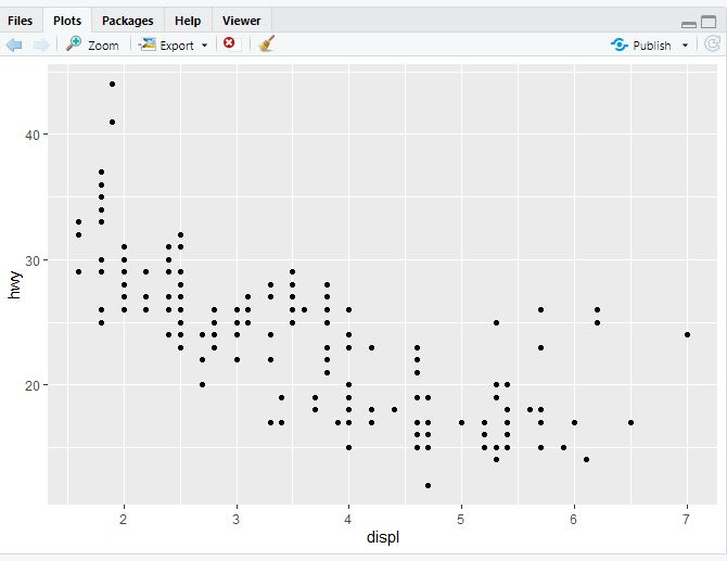
Going through the syntax we discussed above, the data are the mpg dataframe, the geom function is geom_point to make a scatter plot, and we mapped the displ variable (engine displacement, which is a proxy for engine size) to the x axis and the hwy variable (highway miles per gallon) to the y axis. These are the required building blocks for any visualization; at the very least, we need to say what data go where. Beyond that, though, there are so many more ways to customize our plots, both in the amount of data we are able to show and in purely aesthetic choices.
You can choose any two variables for your scatterplot, but some might be more useful than others. Let’s look at a different pair of variables this time, class and drv (the type of drive train). If you’re following along in R4DS, this is exercise 5.
ggplot(data = mpg) +
  geom_point(mapping = aes(x = class, y = drv))
You should get something like this:
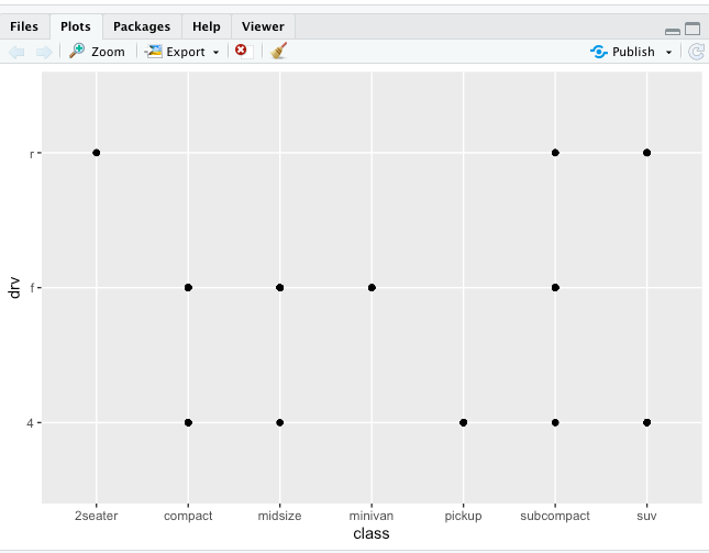
There’s not much we can get from this, because class and drv are categorical rather than continuous. As we’ll see soon, there are ways to plot categorical data that are more informative.
Aesthetic Specifications
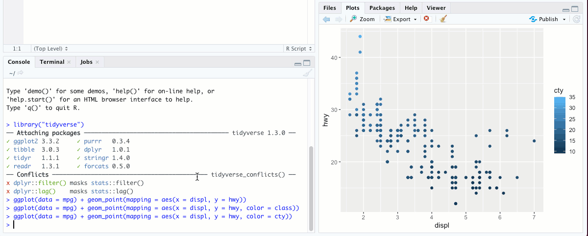
What’s fun about mappings in ggplot is that you can map lots of other aesthetics besides just what’s on the x or y axes. Some of them just make your chart look nice. Others, however, can reveal important information about your data! For example, let’s go back and look at our displ vs hwy scatterplot again, but this time, we’re going to add another dimension to our plot.
The color aesthetic is great for categorical data, like class. Not only does the graph look way cooler, we can actually get some interesting insights into the data we didn’t have before. See that small cluster of points that fall a bit outside the trend, around displ = 6 and hwy = 25? By mapping class to the color aesthetic, we can see that this cluster is the “two-seater” class, and we can see here they have better gas mileage than you might expect given the size of their engines! Sports cars, maybe?
Color doesn’t have to be just for categorical data, either. Try running the code above, but replace variable class with a numerical variable, like cty (the city gas mileage). You’ll get something that looks quite different from the previous graph, but is useful in other ways.
There are also other aesthetics we could have chosen instead of color, including alpha (the transparency of the points), shape (the shape of the points, as you’d expect, though there are more than six groups and so the SUV points get dropped), or size (the size of the points, though this is usually better for continuous variables than for discrete variables and RStudio will give you a warning if you pick this one). Try these out, see what they look like!
You can also perform logical tests with variables and map that to an aesthetic instead. Let’s try an example:
ggplot(data = mpg) +
  geom_point(mapping = aes(x = displ, y = hwy, color = displ > 5))
You can also set any of these aesthetics to a value instead of a variable, if you just want to change the look of your graph. For example, we could change all of the points to a single color:
Notice that this time, the bit where we are specifying color, color = "blue", is a bit different than when we wrote color = class. First, this time the color aesthetic went outside the parentheses that contains the x and y specifications. This is because in the second case, we’re setting color to a constant value rather than mapping it to a variable. Try running the same code with color = "blue" inside the parentheses:
ggplot(data = mpg) +
  geom_point(mapping = aes(x = displ, y = hwy, color = "blue"))
See what happens. Go on, I’ll wait. Also note that when you set color (rather than mapping it to a variable), the name of the color will need to be in quotation marks.
To learn more about the aesthetic specifications you can use with geom_point, you can run ?geom_point in the console and you’ll see some useful info. For more about aesthetic specifications in general and the different ways you can use them, run vignette("ggplot2-specs") in the and read the Aesthetic Specifications appendix.
Facets
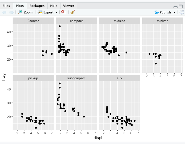
Aesthetics specifications aren’t the only way to display additional variables in your plot. Instead of having everything on one plot, you could also separate them into subplots using “faceting,”. You can do this with one additional variable with facet_wrap() or with two using facet_grid(). Let’s try facet_wrap() first:
ggplot(data = mpg) +
  geom_point(mapping = aes(x = displ, y = hwy)) + facet_wrap(~ class, nrow = 2)
You should get this:
The ~ above indicates a formula, a type of data structure in R that establishes relationships between variables. Don’t worry about it too much for now, it’ll come up again later.
Notice that you can change the number of rows and columns with nrow and ncol, and there are a several other arguments as well- check out ?facet_wrap to find out more.
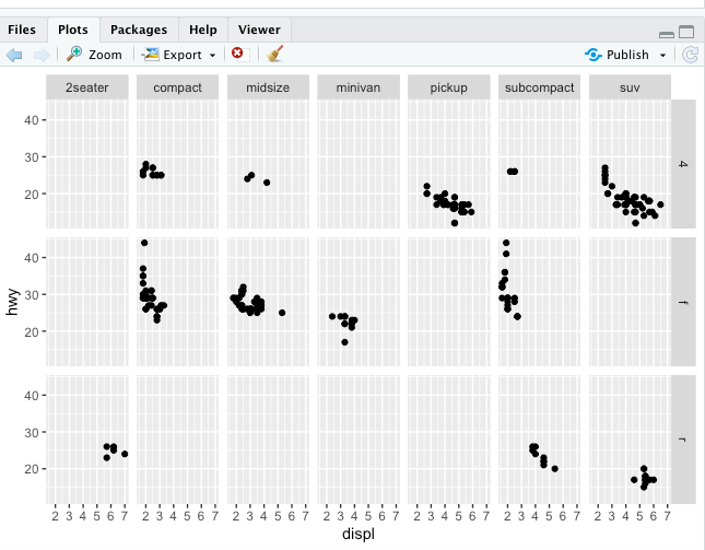
Now let’s look at facet_grid() to add another variable to the mix:
ggplot(data = mpg) +
  geom_point(mapping = aes(x = displ, y = hwy)) + facet_grid(drv ~ class)
You can actually use facet_grid() instead of facet_wrap() with one variable- it’ll give the plot a slightly different look, and one that might be preferable in certain circumstances. To do that, just replace one fo the variables in the function call to a ., like this:
ggplot(data = mpg) +
  geom_point(mapping = aes(x = displ, y = hwy)) + facet_grid(. ~ class)
Try it out, see what it looks like!
One final thing to note is that faceting only works with discrete variables, not continuous ones. RStudio will let you do it, but it’ll take each value of that variable in the table as a facet as if it were a discrete variable. Not super useful.
Going Beyond the Scatterplot
Obviously, scatterplots are not the only way you can (or should) plot your data, so ggplot2 has geoms for pretty much any plot you can think of. Which one you pick will depend on what kind of data you have and what questions you’re asking. I could go through all of them… but how about I just give you the link to a nifty ggplot2 cheatsheet that has tons of info about the various geoms and their arguments.
And since we’ve brought up the cheatsheet, let’s talk about something that might be confusing. You probably noticed by now that when we’ve been setting arguments or specifying aesthetics we’ve been explicit about it. Here’s an example of what I mean:
ggplot(data = mpg) +
  geom_point(mapping = aes(x = displ, y = hwy))
Those spots where we write data = , mapping = , etc.? Not actually necessary. As you’ll see in the cheatsheet, you could write the above code like this:
ggplot(mpg) +
  geom_point(aes(displ, hwy))
It’ll work just the same! So why do we do it the long way at all? There’s a couple of good reasons:
- There are aesthetics you’ll always need to state outright. Color? You’ll need to spell it out. Same with shape. The above example works only because, like I mentioned before, it’s the bare minimum- you will always specify a dataset, and the necessary variables. But since we’ll have to be explicit about the optional variables, why not just make it habit for all of them?
- If you continue coding in the future, there will be many times where you write code that will be used by others or by yourself in the future. In general, the more explicit about everything you can be, the better. Spelling out everything that can be spelled out will make your code more readable, and that’s always a plus.
So we’re going to get into good habits and be explicit about everything, yes? Cool.
Anther cool thing I’ll say about geoms is that you can layer them on top of each other using the +, just like this:
ggplot(data = <DATA>) +
  <GEOM_FUNCTION1>(mapping = aes(<MAPPINGS1>)) +
  <GEOM_FUNCTION2>(mapping = aes(<MAPPINGS2>))
In fact, you can the + to string along other functions too, functions that can set the scale, add a theme, change axis labels… the list goes on! And although this kind of stringing multiple functions in one piece of code isn’t unique to ggplot2 (later we’ll check out another way this is done called the pipe) the + syntax is unique to ggplot2.
One nice time-saving (and error-reducing) tip for using multiple geoms on the same plot: if the mappings above (represented by MAPPINGS1 and MAPPINGS2) are the same, you can pass them into ggplot() instead, and they will apply to all of the geoms that come after, unless you pass those arguments into the geom itself.
So the above code becomes:
ggplot(data = <DATA>, mapping = aes(<MAPPINGS>)) +
  <GEOM_FUNCTION1>() +
  <GEOM_FUNCTION2>()
If there are any mappings that you want to apply to only one of the geoms, it’ll still have to be passed into that geom. Try out a few variations, see what you get! Here’s one example for you to try out:
ggplot(data = mpg, mapping = aes(x = displ, y = hwy)) +
  geom_point(mapping = aes(color = class)) +
  geom_smooth()
In the next chapter, we’ll look at even more cool stuff you can do with plots!