
Python Lab for Beginners
So, you have a .csv of data, and you want to do some scripted analysis on it in Python. Why? Because you think that your analysis will need to be repeated, either by your team (more data will come in) or by other researchers (who may want to validate or reproduce your findings). You don’t want to have to do a multi-step process in Excel or a commercial statistical software product every time, you’d rather have a script you can just run every time you get more data.
This lab takes you through the steps of doing this. If you do the step-by-step version (recommended, if you’re a first-timer), expect to spend an hour on this. If you prefer to just download the final code (as a notebook or as pure python, you can do this in just a few minutes and simply review the parts that aren’t familiar.
What will we do? We’ll obtain data, bring it into Python, look at it, make a few corrections to badly coded data, correct column names, do some summary stats, and visualize the data. We’re not going to get to the point of creating models or doing statistical tests just yet.
Want to watch a video of me doing what I describe below? You can do that here! It’s quite lengthy (40 minutes) but it’s intended for the brand-new user of Python (and/or JupyterLab).
Getting Python
You’ll want to (if you haven’t already) install the Anaconda distribution. A little vocab: Python is a language, Anaconda is a distribution that includes Python as well as many helpful Python packages, and Jupyter Notebooks and JupyterLab documents are “REPL” environments (Read, Evaluate, Print Loop), or a way to program interactively. I like Anaconda because it helpfully bundles all the packages you need for basic data analysis, so you don’t have to worry about piecemeal installation as you go along learning. But if you have a different approach, that’s fine! As long as you have Python 3, numpy, pandas, re, and matplotlib, you should be able to follow along below.
Data Source
In our case, we’re going to use a dataset shared on the UC Irvine machine learning data repository. Specifically, we’re going to use a cervical cancer risk dataset.
Start Anaconda Navigator
Open Anaconda Navigator. If it’s your first time ever using it, you might want to read some documentation about Anaconda Navigator.
Don’t have or want Anaconda, because you’ve already done some work in Python? Start a Jupyter Notebook by typing “jupyter notebook” into your console (you can pip or conda install jupyter if needed).
Get the Data
We want to get the data into our Python environment so we can do things with it. In your notebook, type the following:
import pandas as pd
import numpy as np
cervical_cancer_data = pd.read_csv("http://archive.ics.uci.edu/ml/machine-learning-databases/00383/risk_factors_cervical_cancer.csv")
We’re importing packages we need, and making the csv we download from the given URL into an object with the name “cervical_cancer_data”.
To run the code, make sure the cell is selected (the edge should change color), and hit the “Play” triangle button to run it:
Inspect the data
To take a quick peek at the data, type the following in a new cell and run it.
cervical_cancer_data.head()You should see output like this:
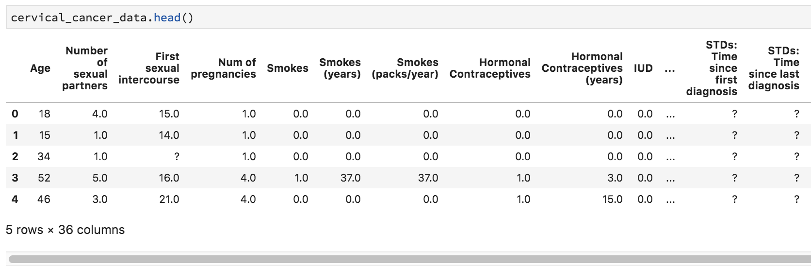
Uh-oh, we see a few question marks listed in our quick preview of the data. What is that about?
We can look at the data types as well, which doesn’t clarify matters much:
cervical_cancer_data.dtypes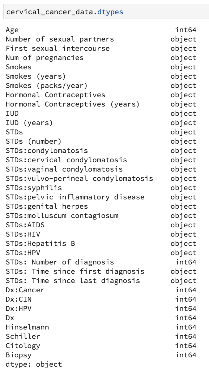
When we look at the data it seems clear that the question marks are intended to be placeholders for “no data available”. We can’t do math on question marks, so that’s going to mess us up. Let’s fix our read_csv command so that it automatically turns question marks into empty values (NaN’s). Go back to your source pane and amend the read_csv statement so that it looks like this:
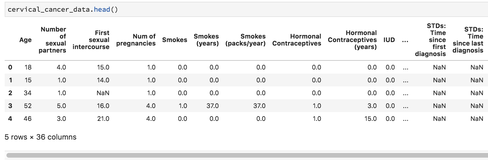
cervical_cancer_data = pd.read_csv("http://archive.ics.uci.edu/ml/machine-learning-databases/00383/risk_factors_cervical_cancer.csv", na_values="?")What we’re doing here is passing in the value (or values, passed as a list: [”?”, “–”]) we want to turn into NaN (empty, null) values. To check that it worked, try re-running the cell that contains cervical_cancer_data.head() – you should see NaN instead of ?.
Statistical Exploration
Let’s do some statistical exploration. In a new cell, type cervical_cancer_data.describe() and execute the code.
Scroll through the output. Do you notice anything nonsensical?
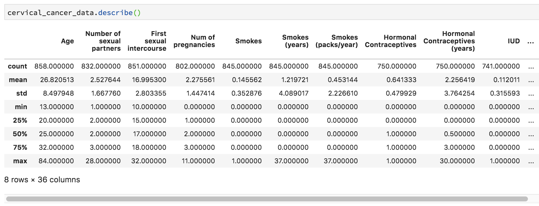
Some things make perfect sense, like mean and median Age and the number of NAs (missing data) in Number of sexual partners. Other things don’t make any sense. For example, Smokes seems to be a category, but it’s being treated like a number, because that’s how it was coded. Finding the third quartile of a category variable doesn’t make sense.
This happens a lot in data, and if you’re not careful you can do something silly like calculate median ZIP code, if you don’t recognize that sometimes numbers aren’t really numerical data, but rather, categorical data. How can we tip off R that variables like these aren’t true numerical data?
We can tell Python that these are “bool” (boolean) variables (that contain only True / False values).
Variable Type
To grasp more fully which variables should be continuous numerical variables and which are categorical or logical, we should check out the data dictionary for this data, which is available (but sparse!) at https://archive.ics.uci.edu/ml/datasets/Cervical+cancer+%28Risk+Factors%29#, under the “Attribute Information”. In this listing, there are two kinds of variables – int, or integer, and bool, or boolean (true/false). In boolean algebra, true is generally coded as 1 and false as 0, so we’ll assume that’s the case here. It’s too bad there’s not a fuller data dictionary with more details!
Also, some of the “bool” values here look like they should be “int” – like smoking pack years. When sharing data, it’s so important to make sure that your coding and data descriptions are complete and accurate. Still, in the un-ideal world of real data, this kind of thing really does crop up, so we’ll take this as a learning opportunity.
True/False Values
Let’s test using a handful of columns. For example, try executing cervical_cancer_data['Smokes'].value_counts() .
Mostly zeros, and a handful of ones. Looks like our True/False assumption holds – it looks like this is a true = 1, false = 0 situation. Note that in the video, I neglect to do this step, so make sure to practice it yourself.
In case it’s not obvious, we just used square brackets to indicate which column we wanted from our table. There are other ways to indicate which column(s) and/or row(s) we want, but this method is pretty frequently used when you’re doing analysis across all values of a given variable in a pandas data frame.
Numeric, or Logical?
Most of the columns seem to make sense, when I compare the data itself (looking just at the data viewer) with the description of the data as int or bool. But there are two smoking-related columns that seem iffy. Let’s double check them with value_counts(). Try cervical_cancer_data['Smokes (years)'].value_counts() and cervical_cancer_data['Smokes (packs/year)'].value_counts(). Again, I don’t do this in the video above, so give it a shot yourself.
Both show a variety of values, and not just “integer” data, but continuous or decimal data. These are clearly not boolean variable types, regardless of what the scanty data dictionary may say.
Renaming Columns
Before we work on setting the variables that need to be recoded as logical or factor variables, let’s rename them. The csv that this data comes from had things like spaces and parentheses, which, while they’re rendered okay in Python, would be illegal variable names in many languages. This makes the column names a bit clunky and hard to work with if we have to pass our analysis or data on to others.
Let’s get the current names of our variables by typing the following into the console:
cervical_cancer_data.columns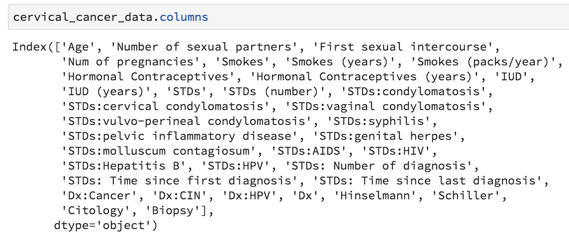
We could, if we wanted to, create our own names, making a concatenation of 36 new names and assigning it to cervical_cancer_data.columns, but really all I want to do is make everything lower case and replace all instances of spaces and punctuation with an underscore.
To do this, I’ll first make everything lower case. I’ll add the following to my notebook, and run the line of code:
cervical_cancer_data.columns = cervical_cancer_data.columns.str.lower()Now, to replace the spaces and punctuation with underscores, I’ll use a package called “re”, for “regular expressions”. Regular expressions are very useful, and we don’t have time in this lab to go into it. Want to learn more? Check out the regex article on this website!
To bring re into my Python environment, I’ll add the following to my notebook and run it:
import reNow I can use the re package’s function re.sub to find a pattern of one or more (that’s the +) non-letter (that’s the [^a-z]) in the names and replace them with an underscore. The command below uses what’s called a “regular expression”, or regex. It goes beyond the scope of this article, but it’s very very useful to learn. At any rate, add this command to your script and run it.
cervical_cancer_data.columns = [re.sub("[^a-z]+", "_", col) for col in cervical_cancer_data.columns]Let’s look at the column names now. Run cervical_cancer_data.columns again (you can just re-run the code block that has that command in it). Much better, right? But there are a few that have an underscore at the end of the name. Let’s fix that with another regular expression replacement. Add and execute the following in your script:
cervical_cancer_data.columns = [re.sub("_$", "", col) for col in cervical_cancer_data.columns]Setting Variable Type
Ok, finally we are ready to set our categorical variables to actually be the right type! We know that our current values are the numbers 0 and 1, where 0 means False and 1 means True. Because this is a special kind of category, we’ll use the .astype("bool") method to tell python that it should turn the 0s and 1s into Falses and Trues. Because 0 is conventionally False and 1 is True, we really only have to issue one simple command to turn a column into a True/False variable. Add the following to your notebook and execute it.
cervical_cancer_data['smokes'].astype("bool")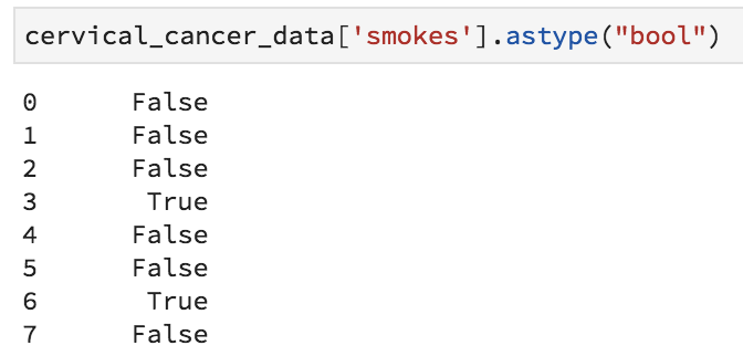
Great, a series of True and False values, instead of 1 and 0 values. We’re definitely on the right track. The annoying thing is that we have to do this for multiple columns. I’ve figured out which columns these are, so that it should be easy to form a two-line loop to fix them! Notice how in Python, the indentation that occurs inside the loop is meaningful. Whitespace is important in Python!
boolean_cols = ["smokes", "hormonal_contraceptives", "iud", "stds",
                "stds_condylomatosis", "stds_cervical_condylomatosis",
                "stds_vaginal_condylomatosis",
                "stds_vulvo_perineal_condylomatosis",
                "stds_syphilis", "stds_pelvic_inflammatory_disease",
                "stds_genital_herpes", "stds_molluscum_contagiosum",
                "stds_aids", "stds_hiv", "stds_hepatitis_b", "stds_hpv",
                "dx_cancer", "dx_cin", "dx_hpv", "dx", "hinselmann",
                "schiller", "citology", "biopsy"]
for x in boolean_cols:
    cervical_cancer_data[x] = cervical_cancer_data[x].astype("bool")
Take a look at your data now (you can rerun a .head() cell) – it should be much more intuitive, and ready for analysis.
Graphical Exploration
Let’s see what the distributions of our data are. We can use cross-tabulations and graphical data visualizations to take quick peeks. To assist us, we’re going to use matplotlib. Add and execute the following:
from matplotlib import pyplot as plt
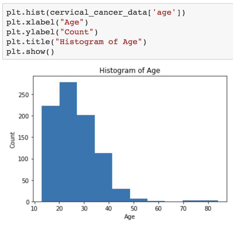
%matplotlib inlineWhat if we want to see the distribution of ages? Try the code below. In pyplot, we add layers bit by bit and only at the end do we issue the plt.show() command.
plt.hist(cervical_cancer_data['age'])
plt.xlabel("Age")
plt.ylabel("Count")
plt.title("Histogram of Age")
plt.show()
Hopefully you see an image like this:
What about a boxplot of number of sexual partners?
plt.boxplot(cervical_cancer_data['number_of_sexual_partners'])
plt.show()
Ugh, an error occurs. This is because we can’t pass NaN values to boxplot. We’ll select only the values that are not NaN. Replace the code that doesn’t work with this, instead:
plt.boxplot(cervical_cancer_data['number_of_sexual_partners'][~np.isnan(cervical_cancer_data['number_of_sexual_partners'])])
plt.show()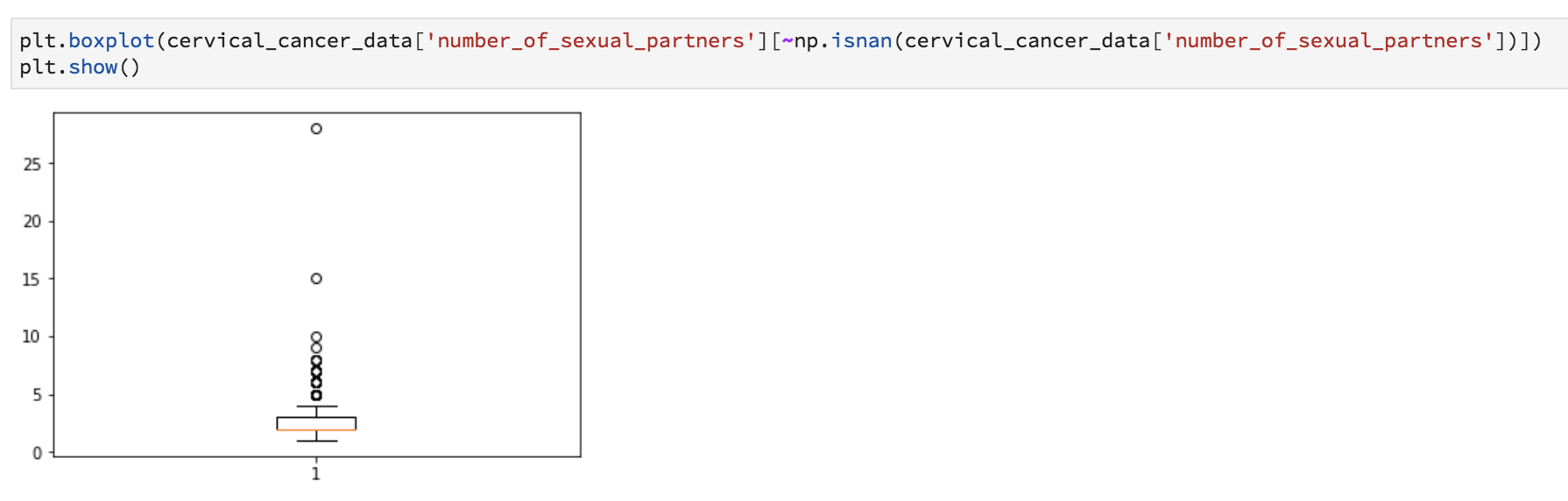
Want to see if there’s a relationship between years of smoking and number of STDs? Let’s do a scatter plot.
plt.scatter(cervical_cancer_data['smokes_years'], cervical_cancer_data['stds_number'])
plt.xlabel("Smoking Years")
plt.ylabel("Number of STIs")
plt.title("Sexually Transmitted Infections as a Function of Smoking Years")
plt.show()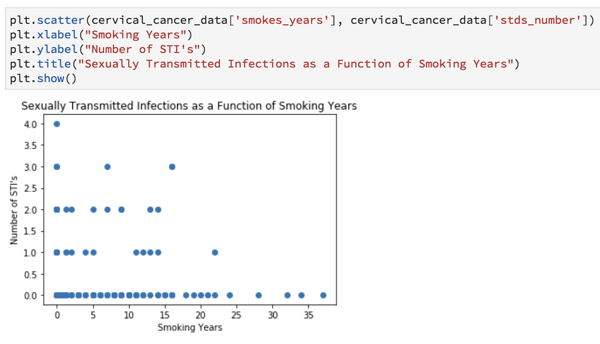
Obviously these graphics aren’t publication-ready, but are helpful for understanding the data and coming up with preliminary answers to questions like:
- Is my data normally distributed?
- Does there seem to be a relationship?
- Are there any weird outliers?
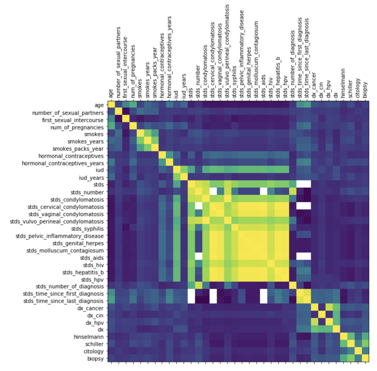
What if we want to create a correlation matrix heatmap to see how different factors correlate?
Give this a shot in your notebook:
corr = cervical_cancer_data.corr()
plt.matshow(corr)
plt.xticks(range(len(corr.columns)), corr.columns, rotation='vertical')
plt.yticks(range(len(corr.columns)), corr.columns)
plt.rcParams["figure.figsize"] =(15,10)
plt.show()
Hopefully you see a nice correlation heatmap like this one. It might also come out too small, but don’t worry, we’re going to move on from this pretty quickly, because it doesn’t have all the helpful things we want, like a key to what the colors mean.
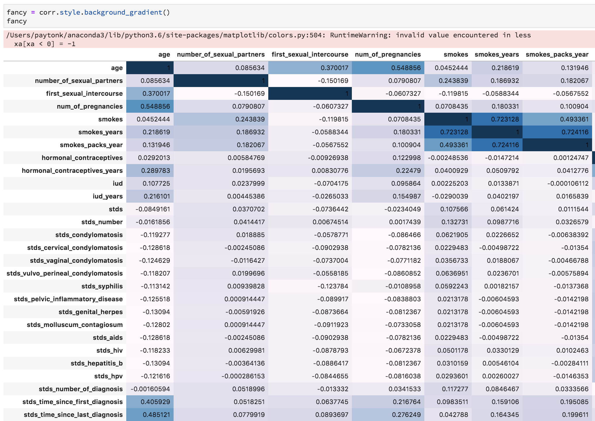
Instead, let’s create a colorful background for the correlation matrix itself, which could prove useful!
corr.style.background_gradient()You’ll get a minor error related to NaN values, but you should also see a colorful table which helps illustrate the various correlations!
Non-Graphical Exploration
Issue the following, which gives you a table of genital herpes and cancer diagnoses:
pd.crosstab(cervical_cancer_data['dx_cancer'], cervical_cancer_data['stds_genital_herpes'])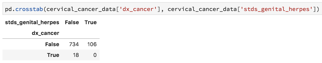
You’ve already seen how to get basic summary stats on your data. This time, we’ll do something a bit different, to identify which columns might not be good variables to use in the research because of lots of missing data.
cervical_cancer_data.isna().sum()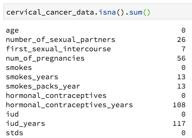
There are rather a few variables that are missing lots of values. This includes most of the STD fields. We might want to clean up our data by removing these columns (runs the risk of abandoning a great explanatory variable), or remove the rows for which data is absent (runs the risk of subject selection bias), or by interpolating data, perhaps by putting in a median value (probably not valid here).
Let’s leave things there, and in a second lab, we’ll work on basic inferential statistics!