
Intro to Machine Learning: Trees
The goal of this post is to get you working in some very basic machine learning practice in R. You can follow along below, or download the complete code.
Intro to Machine Learning: Trees
This is intended to be one of a series of bite-size documents to help you understand what predictive, supervised machine learning is and how to do it in R, without knowing a lot of math or computation. The goal is to get you doing machine learning right away, with enough knowledge to get you interested in doing more.
Machine learning has many applications and meanings, but for our purposes, we’ll define our particular subset of machine learning this way: “Supervised machine learning for prediction consists of taking some data with a known result (supervised), and coming up with good rules about how the result is related to the rest of the data, so that we can apply those rules and make predictions about data for which we don’t know the result (prediction).”
This is super simple, obviously, and leaves out lots of important concepts, like signal vs. noise, overfitting, etc. But it’s enough to get started.
It’s also important to note that we’re starting here with a classification question, with two possible outcomes (we could say a binomial or binary outcome): presence or absense of dihydrofolate reductase (DHFR) inhibition. There are other kinds of questions, like multi-class classification (with more than 2 bins) and continuous outcome (like predicting salary, IQ, or life expectancy past diagnosis).
Trees
If you’ve ever dealt with a crying baby, you know all about trees. Imagine that there’s a crying baby. How do you calm her? You go through some quick mental calculations to try to predict the cause of the crying. Let’s make some pseudocode:
- If time since last meal >= 3h, predict “hunger”.
- If time since last meal < 3h:
- If grimacing:
- If bad smell, predict “poopy diaper”
- If no bad smell, predict “needs a burp”
- If not grimacing:
- If last diaper change >=3h, predict “wet diaper”
- If last diaper change < 3h:
- If recent loud noise, predict “fear”
- If no recent loud noise, let the other parent figure it out!
- If grimacing:
Here’s a diagram called a flowchart that captures the same decision tree:
You get the idea. Tree diagrams don’t construct a mathematical model based in linear, algebraic relationships, the way regression does. Instead, trees (also called CART algorithms, for Classification And Regression Trees) work to come up with a decision tree that helps categorize things. Let’s do a quick example.
There are lots of places to get data – from your own research, or online. For this example, I’m using some data from the carate package, specifically the dataset dhfr. It’s a dataset that includes molecular descriptor values and a result of active or inactive dihydrofolate reductase (DHFR) inhibition.
Get Data
First I’ll get the data. I need to load caret to get the data.
library(caret)
data(dhfr)
Attribute Information:
We don’t know a lot about this dataset. What is easily available can be obtained by issuing the help(dhfr) command. This is what it returns, in part:
Dihydrofolate Reductase Inhibitors Data
Description: Sutherland and Weaver (2004) discuss QSAR models for dihydrofolate reductase (DHFR) inhibition. This data set contains values for 325 compounds. For each compound, 228 molecular descriptors have been calculated. Additionally, each samples is designated as “active” or “inactive”.
Details: The data frame dhfr contains a column called Y with the outcome classification. The remainder of the columns are molecular descriptor values.
Source: Sutherland, J.J. and Weaver, D.F. (2004). Three-dimensional quantitative structure-activity and structure-selectivity relationships of dihydrofolate reductase inhibitors, Journal of Computer-Aided Molecular Design, Vol. 18, pg. 309–331.
Data Segmentation
Let’s first split up our data. We want to “train” (or create the model) on some data, and test it on a different set of data.
First off, let’s load some libraries we’ll want.
library(lattice)
library(ggplot2)
library(caret)
Then, let’s create a data partition. We have a limited number of data points, so we can split them up into training and testing, but with sufficient numbers in the training dataset. We’ll do 70%, 30% breakup:
# We set a seed for the sake of reproducibility
set.seed(42)

# First, we'll pick off the training data:
inTrain <- createDataPartition(y=dhfr$Y, p = 0.70, list=FALSE)
training <- dhfr[inTrain,]

# Then what's left is testing data.
testing <- dhfr[-inTrain,]
Our plan is to first train a tree on our training data and then measure its accuracy on the same data used to generate the model (thus, the risk of overfitting, or making a model too contingent on this data’s random noise). We will do this a few times using different tree generation algorithms. Once we get a good enough model, we’ll apply it to the testing data just once (this is super important) and see what kind of error we get, and if we have a model that’s going to be suitably predictive.
rpart Algorithm
First, we’ll start with the easiest possible model: predicting class from every other variable, using all the default settings and an rpart (Recursive PARTitioning) algorithm. We’ll use the caret package, because it makes it so easy to try different tree algorithms (see http://topepo.github.io/caret/Tree_Based_Model.html). Additionally, caret includes repeated applications of a model and some tuning within its default settings. Best of all, caret takes existing R machine learning packages and standardizes a single approach to using them, so you only have to learn a single syntax. It’s handy!
To see how good our model is, we’ll use confusionMatrix. Confusion matrix takes reality, compares it to your model’s prediction, and sees how correct it is. We tell the confusion matrix which category counts as “positive” for things like positive predictive value, specificity, etc. In our case, positive equals “active”.
set.seed(42)
tree_model<-train(Y ~ ., data=training, method="rpart")
confusionMatrix(predict(tree_model, training), reference=training$Y, positive="active")
## Confusion Matrix and Statistics
##
## Reference
## Prediction active inactive
## active 126 14
## inactive 17 72
##
## Accuracy : 0.8646
## 95% CI : (0.8134, 0.9061)
## No Information Rate : 0.6245
## P-Value [Acc > NIR] : 5.861e-16
##
## Kappa : 0.7134
## Mcnemar's Test P-Value : 0.7194
##
## Sensitivity : 0.8811
## Specificity : 0.8372
## Pos Pred Value : 0.9000
## Neg Pred Value : 0.8090
## Prevalence : 0.6245
## Detection Rate : 0.5502
## Detection Prevalence : 0.6114
## Balanced Accuracy : 0.8592
##
## 'Positive' Class : active
##
What do all these metrics mean? Which is the most important?
We could favor sensitivity – catching as many active inhibition events as possible, even if that means we tag some non-inhibition data points falsely. But what if we’re dealing with data related to safety, like predicting a hazardous condition? If we’re overzealous about sensitivity and catching every hazardous case, people could get so used to false alarms that they disregard alerts that a situation is hazardous.
Or we could favor, say, positive predictive value – the probability we got it right when we said molecular data predicted inhibition. Or negative predictive value – the probability we got it right when we said there was no inhibition.
Or just overall accuracy – the overall percentage of correct predictions.
Or, especially for unbalanced groups (say you’re trying to predict a rare disease), balanced accuracy, which is the mean of the accuracy for each actual class (in our case, our accuracy for true “actives” and our accuracy for true “inactives).
Ideally, we’d want perfect scores on everything, but in the real world, this is impossible. We have to measure model “success” by one (or more) of these measures.
So much depends on what our priorities are and the situation we’re trying to deal with. Overall, in this case, our predictions seem pretty darn solid.
Visualization
The nice thing about our model is that it’s an rpart type of tree algorithm, so it’s quite simple and can be shown visually in a tree diagram (called a dendrogram). Not all tree models have this visual simplicity!
plot(tree_model$finalModel, uniform=TRUE, margin=0.1, compress=FALSE)
text(tree_model$finalModel, use.n = TRUE, all = TRUE, cex=0.7)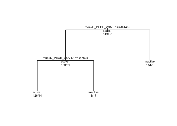
In every branching, “true” is to the left, and “false” to the right. So if we look at the first branch, we see moe2D_PEOE_VSA.0.1 >= -0.4495. This is the question that will give rise to the two branches below. But first, we see another line of text, “active” and some numbers below that: 143/86. Keeping in mind that the first or leftmost value or branch in a dendrogram is “true” or “yes”, we can interpret the first level as “We begin with 143 cases who have ‘active’ = true and 86 cases where ‘active’ status is false. We will split next on whether the moe2D_PEOE_VSA.0.1 variable is greater than or equal to -0.4495.”
Subsequent branches go the same way. At the end of each branch, there are “active” and “inactive” bins that each give their success / error numbers. For example, the leftmost ‘leaf’ is an “active” bin, and it contains 126 active and 14 inactive events.
Sometimes just plotting causes a pretty squished dendrogram. Here’s a nicer way to plot requires the rpart.plot package.
library(rpart.plot)
rpart.plot(tree_model$finalModel, type=4, extra=1)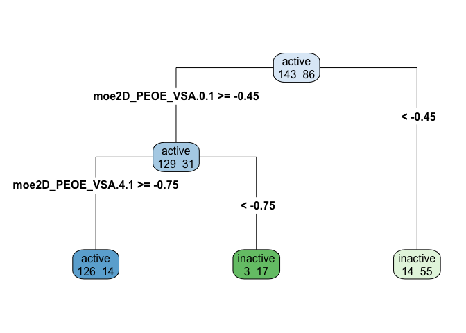
A dendrogram makes it relatively easy (at least once you have the data dictionary and know what each variable measures) to describe the decision tree well. Note that in the dendrogram above, leaves are different colors based on whether they represent bins of active or inactive inhibition, and the intensity of the color represents the amount of entropy (mixed-up-ness). A bright blue or green is pretty uniformly one case, while a paler shade of blue or green is a leaf that is more mixed.
You can see how trees make rough categories that might not always work that precisely. For some data, tree algorithms might not be right at all. For others, you might benefit from combining lots of trees, each of which looks at only part of the data and a section of the variables. The combination of partial trees altogether forms a random forest, which we’ll discuss in another post!
Our final step, once we’ve come up with a “winner”, is to apply it to our testing data. Our model will almost always be less accurate on the testing data as it is on the training data. Let’s think about why: any model is going to do really well on the data it trained on, since it’s tuned on both the signal (the predictive relationship we’re trying to identify, which will be the same in training and testing) and the noise (influences, subject to randomness, that will differ between training and testing) of the training data. The more our model is tuned to random noise, the worse the decline in performance between training and testing data.
Let’s see how much sensitivity and positive predictive value we lose, when we apply our model to the testing data.
confusionMatrix(predict(tree_model, testing), reference=testing$Y, positive = "active")## Confusion Matrix and Statistics
##
## Reference
## Prediction active inactive
## active 53 7
## inactive 7 29
##
## Accuracy : 0.8542
## 95% CI : (0.7674, 0.9179)
## No Information Rate : 0.625
## P-Value [Acc > NIR] : 6.545e-07
##
## Kappa : 0.6889
## Mcnemar's Test P-Value : 1
##
## Sensitivity : 0.8833
## Specificity : 0.8056
## Pos Pred Value : 0.8833
## Neg Pred Value : 0.8056
## Prevalence : 0.6250
## Detection Rate : 0.5521
## Detection Prevalence : 0.6250
## Balanced Accuracy : 0.8444
##
## 'Positive' Class : active
##
Not too shabby! We even gained a little in some metrics, so I think we have a solid model here. Of course, we don’t have to use a “tree” model here – it’s numerical data, so we could also do a logistic model, or a linear regression with thresholds.