The Spreadsheet Betrayal
A continuation of Excel, If You Must…
The two of you grew up together. Maybe you had class, worked on projects at your first job, or even discussed personal financial matters with your significant other. But somewhere along the line that trust that you had fostered soured. Maybe it was because you found you were repeating yourself too often, stuck in a monotonous limbo trying to make things work. Maybe it was an unequal partnership and you felt you were pulling all the weight. And maybe this has left you wondering . . . could things be better?
That’s right. I’m talking about your relationship with your spreadsheet. Whether you embrace Microsoft Excel or Google Sheets, the spreadsheet has become a ubiquitous workplace tool across just about all markets and all hierarchical levels. No longer is “Excel” a talent to set you apart from the competition; “fluent in Excel” is about as commonplace as “able to fill the water cooler.” Sure, you can navigate its familiar pages with ease and pull up some quick visuals at the press of a few buttons, but the practices and mistakes that the spreadsheet can lead you to are many and at times lie just below the surface of what’s really apparent.
Don’t Be Dramatic, It’s Not All That Bad
Isn’t it? Do any of the following statements apply to you?
- I have a massive folder filled with spreadsheets named by version or date and containing similar (if not the exact same) content.
- I have mastered the art of conditional formatting; I’m a visual person and I love the colors.
- Multiple people on my team are logging their work into individual copies of the same spreadsheet.
I think many of us can identify with at least one of these statements. If you’ve ever needed to use an Excel sheet as log but wanted to keep versions of the document without losing the history of changes, you may have a folder that looks a bit like this:
2018-02-01-My-Logging-File.xlsx
2018-02-05-My-Logging-File.xlsx
2018-03-18-MASTER-COPY-My-Logging-File.xlsx
2018-03-18-MORE-MASTERED-My-Logging-File.csv
2018-03-18-MORE-MASTERED-My-Logging-File.xlsx
2018-17-02-My-Logging-File-Whoops-Mixed-Up-Month-&-Day.xlsx
2018-02-17-My-Logging-File-Drats-Dashes-Messed-Up-Order.xlsx
2019-01-01-Lets-Just-Start-Over.xlsx
Unless your organization or team agrees on exact details and is very, and I mean very, good at abiding by strict terms, it’s difficult to avoid a mess of files—especially when due dates pile on and loom close and multiple people begin working on the same files at the same time. Sure, this can be mitigated by migrating to an online cloud-system like Google Sheets, but for many of us that is not be a valid option and we’re stuck saving copies of files with local destinations and varying degrees of differentiation.
And that’s just at a high-level structural perspective. Let’s dig into the files themselves and why the content makes us prone to error.
I’ve Got My Shovel at the Ready
Let’s say you want to make your plot; how do you go about it? Very likely you “Insert” after highlighting your applicable columns of data and do a little tinkering to majestically, magically conjure a beautiful bar/graph/line plot. That’s great!
But what if the data changes? What if a few more rows of observations suddenly appear? What if some of the data needs to be deleted or rearranged? And what if the data periodically changes? This is where we run into our first big spreadsheet issue. In fact, the spreadsheet problem can be boiled down to three design criteria many of us are familiar with:
- Reproducibility
- Reliability
- Validity
Reproducibility
Periodic changes to data require manual manipulation of data. And while the native ability to drag, cut, and paste data with a mouse is second nature to most people, it eats up valuable time and, even worse, exposes the data to the possibility of human error. What if you miss a row when you drag and select the data you want to plot? The plot won’t report that back to you: it’s going to plot exactly what you tell it to.
This is where we run into the first advantage of programmatic (as opposed to spreadsheet) analysis. With scripting languages like R, Python, Matlab, etc., you can easily set up code to process your data without needing to manipulate anything manually. Need all of your dates and times in a proper format? Done. Need to take out all values that aren’t integers? Finished. Scripting allows you to lean heavily on computational logic and written language to coerce the computer to produce exactly what you want. We live in a golden age in which you don’t even need a computer science background to begin speaking to a computer. What education you need is all out there—online and free.
Reliability
Let’s go back to the human error we touched on before. Many times, the data we want to track and analyze is stored manually by a human and entered cell by cell into a spreadsheet. Sometimes the tasks are mundane, tedious, and time intensive. For example, what if we wanted to record hourly lab data of a patient from their electronic medical record? Many people accomplish this by writing down what they see. But if there are multiple patients with numerous data points over the course of many hours it is only a matter of time before the transcriber is going to make an error. This kind of data is unreliable; we can’t fully trust its integrity.
Validity
By most definitions, in the context of design principles, validity is accomplished by ensuring that our reporting is not only reproducible and reliable, it also accurately and meaninfully represents what we’re reporting on. There are many examples of inherent bias in data design, but validity issues reside more with the extraction of the data and less with the vehicle by which it is analyzed. If your data is unreliable, like in the example we used earlier, any report will fail to represent the true data. If we stole our transcriber’s coffee, perhaps the data might be recorded so inaccurately that a truly bad decision could result. This would be considered invalid.
Ok, I Get It. Show Me Your Fancy-Pants Plotting Then
x <- seq(0, 10, .1)
y <- dnorm(x = x, mean = 5, sd = 2)

plot(x = x, y = y, type = "l")
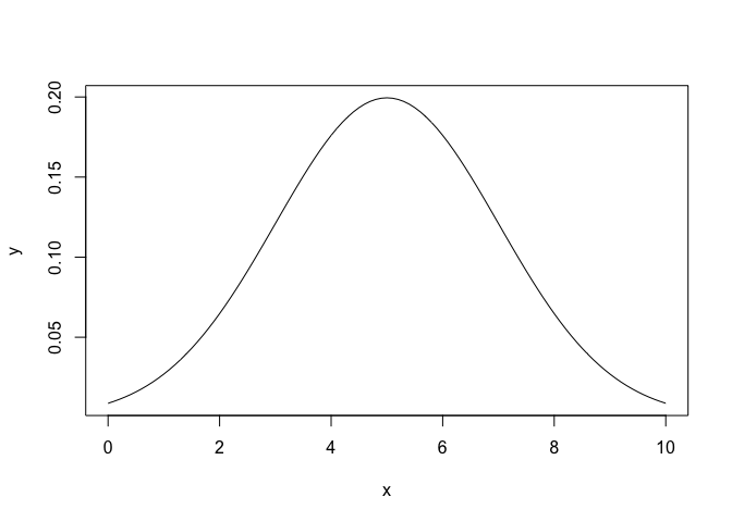
Using a mere three lines of code, we can create a visual depiction of a sample, random normal distribution. And if we had real data, and not randomly generated sample data, we could read that in with one more line of code, via read.csv(), for example. How does this simple example tackle the three design rules we discussed earlier?
- Reproducibility: The code can be used across any number of data sources. Whether you bring in multiple .csv files, .txt tables, etc., as long as you direct your code at these sources, and the data in these sources are formatted correctly, your code will always produce the desired result.
- Reliability: If the data changes, the plot updates accordingly. There is no need to reassign the data that your plot references because you added or deleted a new row or record. The data is the data, and the framework of code is agnostic to its changes (granted that the changes are made appropriately). You change the file, and the program reads the new data, then draws the plot.
- Validity: The code does not change the data. It is merely a vehicle for the end result. There are certainly examples of code that can restructure data and overwrite pieces of it, but generally doing so is bad practice. Ninety-nine percent of the time your code will function as an avenue through which your data is parsed and a result, like the plot, is rendered.
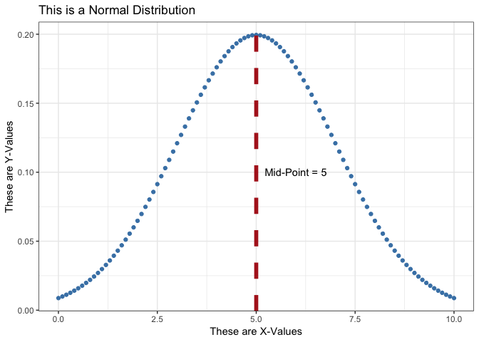
And what if you like the beautiful customization options of spreadsheet charts? In R and Python there are numerous libraries such as ggplot and seaborn which can facilitate customization that often times surpasses spreadsheet capabilities. I won’t go into detail about what’s available, but I highly recommend checking out the R Graph Gallery along with other ARCUS posts such as ggplot Overview for a taste of what is possible. Here’s an example of an aesthetically complex plot using the same data as the first plot:
library(ggplot2)

ggplot(data = NULL, aes(x = x, y = y)) + geom_point(color = 'steelblue') +
  ggtitle("This is a Normal Distribution") + theme_bw() +
  xlab("These are X-Values") + ylab("These are Y-Values") +
  geom_vline(xintercept = 5, colour = "firebrick", linetype = "dashed", size = 2) +
  annotate("text", x = 6, y = 0.10, label = paste0("Mid-Point = ", max(x)/2))
So are Spreadsheets all Bad?
Actually, no—despite all the doom and gloom I’ve expressed regarding spreadsheets. I do think they have a place in the world of data and in fact they offer many benefits. They are also a necessary component of the world we live in and will not be going anywhere any time soon.
Among some of their strengths, spreadsheets allow for quick dives into data. Using a spreadsheet, you can easily work with a data set even with little to no expertise. Spreadsheets are generally intuitive; most folks with even minimal computer experience are familiar with the typical spreadsheet interface. Being able to conduct calculations cell by cell is a uniquely powerful aspect of spreadsheets. Tabular data processed by scripting languages is static. It may look the same with its rows and columns, but being able to inspect individual elements of a table and apply calculations to it is something a spreadsheet is uniquely qualified to do.
A Word of Advice: Eschew Conditional Formatting
Conditional Formatting is a unique spreadsheet feature that allows one to format cells based on rules. Using conditional formatting, you can, for instance, color all cells containing a number greater than 5 red. It is a useful tool for quick visuals, progress tracking, and many other functions. But conditional formatting is not translatable to any other medium. You can’t, for example, export the conditional formatting rules to your data set. They reside in the spreadhsheet file, but not in a way that is understandable to any other program in which you might want to use your data. Conditional formatting rules are, in effect, additional data that you can’t export. You can export all the rows and columns, but if you have added conditional formatting rules like the example (> 5 is red), for each cell there is another, hidden variable, a binary variable that answers the question, “Am I greater than 5?” by using color. That variable is useful only in Excel. So if you want your data to be useful to other people using other programs, avoid using conditional formatting rules to add information. Instead, create real variables and give them their own columns. It’s less handy, perhaps, to do so, but any data scientist down the pipeline from you will not curse your name.