Base R Plotting
R has several ways to visualize your data. For publication-quality graphs, ggplot2 is the solution I’d suggest, and that will be the topic of an additional article. For now, let’s talk about initial data visualization which is not intended for publication, but instead provides some basic insights into data relationships. For this kind of data exploration, I suggest using R’s base plotting system.
Datasets
Let’s play around with some data that R ships with. We’ll use the datasets package:
library(datasets)

# What's available?

library(help = "datasets")
What about the Carbon Dioxide Uptake in Grass Plants? Let’s take a look at that data. It has several different kinds of data – there is categorical data (“factor” in R-speak) in the “Plant”, “Type”, and “Treatment” columns, integer data in the “conc” column, and decimal data in the “uptake” column. I can find out more about this dataset using the following commands:
?CO2
str(CO2)
After reviewing the information, I know that the independent or explanatory variables include Plant, Type, Treatment, and conc, and the dependent or response variable is uptake. I can begin by doing some initial visualizations of my response variable and then take a look at some of my independent variables to see what I’ve got.
Scatterplots and Histograms
Without taking into account any of our independent variables yet, how can we take a look at the results of CO2 uptake? We can use plot or hist to do this:
# Scatterplot
plot(CO2$uptake)
# Histogram
hist(CO2$uptake)
# A more granular hist with 20 bars
hist(CO2$uptake, breaks=20)
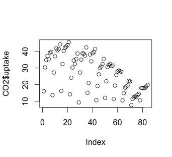
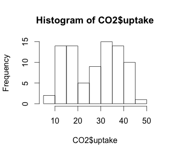
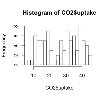
The histogram suggests that there may be some variable that creates a low distribution and a high distribution. Our scatterplot shows some interesting clusters. Now we need to understand what our independent variables are in order to understand a bit more about where to look next. Also, given that we have multivariate data, we’ll need to figure out some way to look at data combinations – what’s the uptake for a chilled Quebec plant? Does the response to CO2 concentration vary based more on plant source, or more on treatment type (chilled or not)? Does the fact that a plant comes from Quebec mean that the chilling has less effect on the CO2 uptake? We will have to be creative to look at multiple variables in a 2-dimensional medium (our screen). But first, we have to understand a bit more about our independent variables.
Tables
In order to look at our independent variables, we’ll begin by using table, a non-graphical way of examining our data:
> table(CO2$Plant)

Qn1 Qn2 Qn3 Qc1 Qc3 Qc2 Mn3 Mn2 Mn1 Mc2 Mc3 Mc1
  7   7   7   7   7   7   7   7   7   7   7   7

> table(CO2$Plant, CO2$Treatment)

      nonchilled chilled
  Qn1          7       0
  Qn2          7       0
  Qn3          7       0
  Qc1          0       7
  Qc3          0       7
  Qc2          0       7
  Mn3          7       0
  Mn2          7       0
  Mn1          7       0
  Mc2          0       7
  Mc3          0       7
  Mc1          0       7

> table(CO2$Plant, CO2$Type)

      Quebec Mississippi
  Qn1      7           0
  Qn2      7           0
  Qn3      7           0
  Qc1      7           0
  Qc3      7           0
  Qc2      7           0
  Mn3      0           7
  Mn2      0           7
  Mn1      0           7
  Mc2      0           7
  Mc3      0           7
  Mc1      0           7

> table(CO2$Plant, CO2$conc)

      95 175 250 350 500 675 1000
  Qn1  1   1   1   1   1   1    1
  Qn2  1   1   1   1   1   1    1
  Qn3  1   1   1   1   1   1    1
  Qc1  1   1   1   1   1   1    1
  Qc3  1   1   1   1   1   1    1
  Qc2  1   1   1   1   1   1    1
  Mn3  1   1   1   1   1   1    1
  Mn2  1   1   1   1   1   1    1
  Mn1  1   1   1   1   1   1    1
  Mc2  1   1   1   1   1   1    1
  Mc3  1   1   1   1   1   1    1
  Mc1  1   1   1   1   1   1    1
We have twelve plants, each of which has a unique identifier, with the first letter indicating its source, the second letter indicating its chilled or nonchilled status, and a numeral indicating which of the three plants of this source and status this particular plant is. Each of our dozen plants is placed under the seven CO2 concentration levels and the uptake is measured.
Plotting Simple Relationships
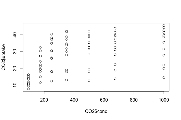
Now that we have a grasp on our experiment and the possible relationships, let’s do some initial 2-dimensional plots. We can use plot in one of two ways: we can give it an X, Y pair of data vectors, or we can ask it to plot Y ~ X. In R, ~ can be read “as a function of”. For example, if we wanted to do a scatterplot of CO2 uptake as a function of CO2 concentration, we could use either of the following commands to come up with an identical plot:
plot(CO2$conc, CO2$uptake)
plot(CO2$uptake ~ CO2$conc)
Multidimensional Scatterplots
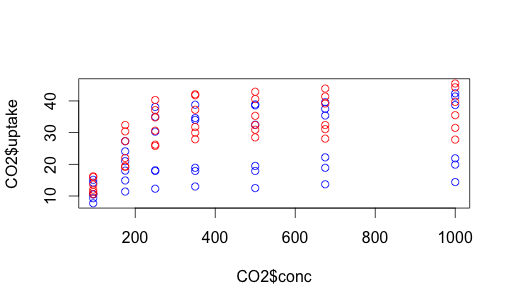
The issue here, of course, is that we have lots of variation still unaccounted for. Some of these data points represent Quebec plants, others Mississippi plants. Some were chilled, some were not. How can we capture that complexity? One way is with color. Let’s make the data points for chilled plants blue, and the data points for non-chilled plants red.
# use "n" to stop us from immediately plotting the points.
plot(CO2$uptake ~ CO2$conc, type="n")
# we could also use a hexadecimal color representation,
# or use colors() to find out more possibilities.
with(subset(CO2, Treatment == "chilled"), points (uptake ~ conc, col = "blue"))
with(subset(CO2, Treatment == "nonchilled"), points (uptake ~ conc, col = "red"))
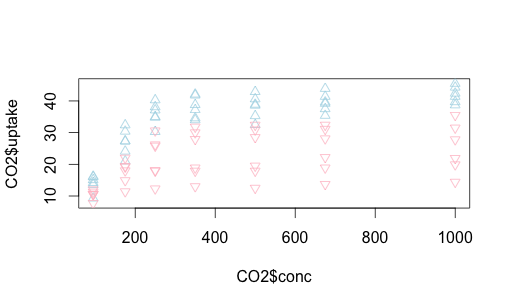
We can do something similar with Quebec vs. Mississippi. This time let’s make the shapes different, as well as play around with colors a bit more. You can find shape identifiers by issuing the ?pch() command.
plot(CO2$uptake ~ CO2$conc, type="n")
with(subset(CO2, Type == "Quebec"), points (uptake ~ conc,
	                                col = "lightblue", pch=2))
with(subset(CO2, Type == "Mississippi"), points (uptake ~ conc,
	                                col = "pink", pch=6))
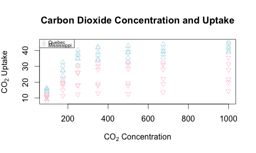
Let’s replot this with some helpful text on the axes and overall, and add a legend to the upper left, making it easy to read.
# Adding a main label, x label, and y label.  Note subscript notation.

plot(CO2$uptake ~ CO2$conc,
	main = "Carbon Dioxide Concentration and Uptake",
	xlab = expression("CO"[2]*" Concentration"),
	ylab = expression("CO"[2]*" Uptake"), type="n")
with(subset(CO2, Type == "Quebec"),
    points (uptake ~ conc, col = "lightblue", pch=2))
with(subset(CO2, Type == "Mississippi"),
    points (uptake ~ conc, col = "pink", pch=6))

# Add a smallish (cex=0.6) legend that has the same shapes (pch)
# and colors (col)

legend("topleft", pch=c(2,6), col=c("lightblue", "pink"),
     legend = c("Quebec", "Mississippi"), cex=0.6)
Boxplots
What happens if we try using plot on a factor (categorical) vector? Let’s try it with uptake as a function of chilled or non-chilled:
plot(CO2$uptake ~ CO2$Treatment)
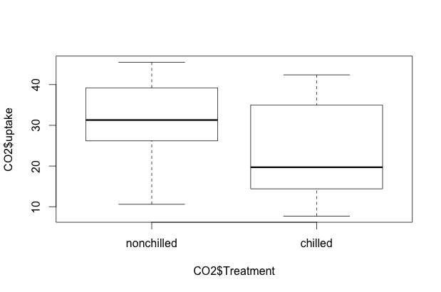
R is smart enough to know that we want a side-by-side boxplot. A similar boxplot will appear if we issue the R command plot(CO2$uptake ~ CO2$Type). We can also specify boxplot() instead of plot().
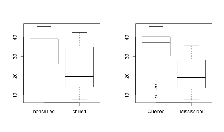
We’d like to understand the interaction of these various explanatory variables. How could we see various dimension of the data in side-by-side histograms? This is an example of where par() comes in handy. The par() variables allow you to change certain default values of R’s base plotting system. In our case, we’ll change the layout so that we get one row and two columns. Keeping in mind that R always puts row and column identifying information in that order (row, column), we can describe our desired output as c(1,2). We can add this parameter to either mfrow (fill my displays by row order) or mfcol (fill my displays by column order), since either one will fill the two plots in the same order. We’ll set mfrow in this case, then plot two boxplots:
par(mfrow = c(1,2))
boxplot(CO2$uptake ~ CO2$Treatment)
boxplot(CO2$uptake ~ CO2$Type)
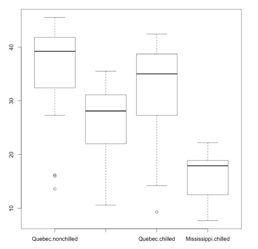
I could also plot the boxplot of reuptake as a function of both Type and (and here gets rendered as a plus sign) Treatment. The labels here might be a bit squished:
par(mfrow = c(1,1))

boxplot(CO2$uptake ~ CO2$Type + CO2$Treatment)
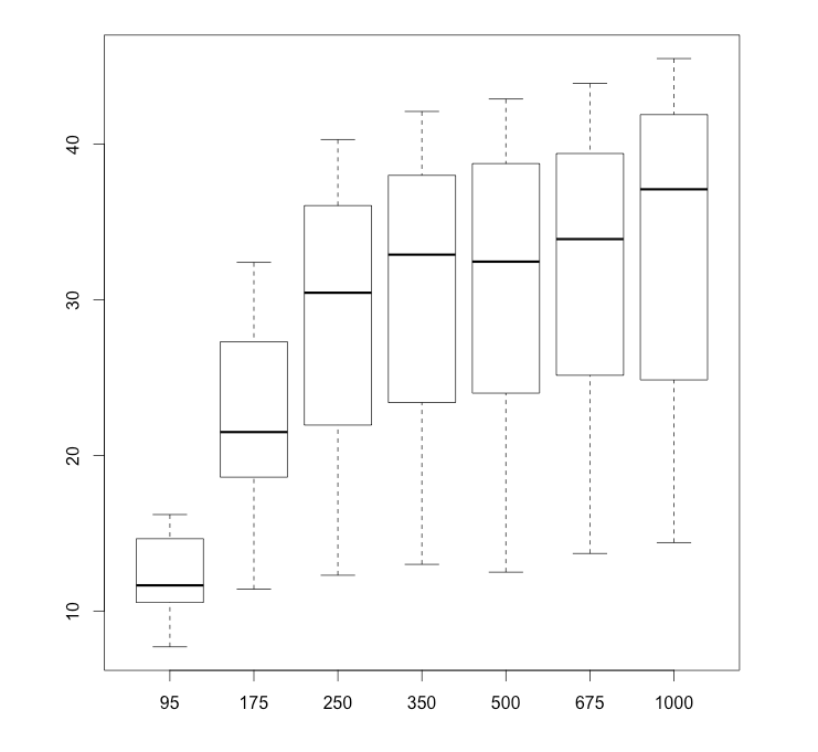
Alternatively, if I am comparing several groups and want to see them all on a single boxplot, I can separate them by commas. Let’s see a 7-way boxplot of the 7 carbon dioxide concentration levels. I’ll use subset to gather just the data points for each level of CO2.
# reset my plot window: 1 by 1.
par(mfrow = c(1,1))

boxplot(subset(CO2$uptake, CO2$conc == 95),
subset(CO2$uptake, CO2$conc == 175),
subset(CO2$uptake, CO2$conc == 250),
subset(CO2$uptake, CO2$conc == 350),
subset(CO2$uptake, CO2$conc == 500),
subset(CO2$uptake, CO2$conc == 675),
subset(CO2$uptake, CO2$conc == 1000),
names = c("95", "175", "250", "350", "500", "675", "1000"))
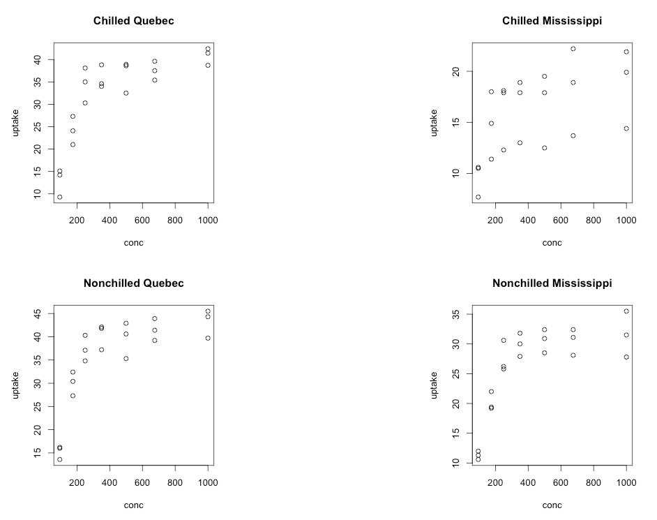
One Last Example
Last, but not least, let’s consider making a 2 by 2 plot, filling it by rows (the way we read, left to right then down to the next row), with four plots which represent uptake as a function of concentration for each combination of chilled/nonchilled as well as source/type:
par(mfrow = c(2,2))
plot(uptake ~ conc, data = subset(CO2,
	Type == "Quebec" & Treatment == "chilled"),
    main="Chilled Quebec")
plot(uptake ~ conc, data = subset(CO2,
	Type == "Mississippi" & Treatment == "chilled"),
    main="Chilled Mississippi")
plot(uptake ~ conc, data = subset(CO2,
	Type == "Quebec" & Treatment == "nonchilled"),
    main="Nonchilled Quebec")
plot(uptake ~ conc, data = subset(CO2,
	Type == "Mississippi" & Treatment == "nonchilled"),
    main="Nonchilled Mississippi")