
Customizing ggplot2 Visualizations With ggThemeAssist
Ever struggle with getting your ggplot2 visualization to meet all of your needs? Tired of having to go to Stack Overflow every time you prepare a graph for publication? Here’s an easy-to-install tool I think you’ll like: ggThemeAssist.
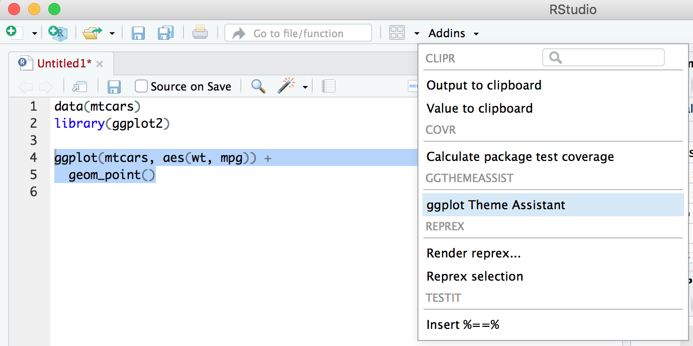
ggThemeAssist is a supplement to RStudio that helps you with customizing one aspect of your visualization: the theme. This package can help do common thematic customizations like changing axis titles, the color of the background of the plot, the placement of the legend, the angle of axis labels, and so on. ggThemeAssist will appear in your “Addins” menu at the top menu bar. To use it, highlight a ggplot chunk of code and then select “ggplot2 Theme Assistant” from the “Addins” menu.
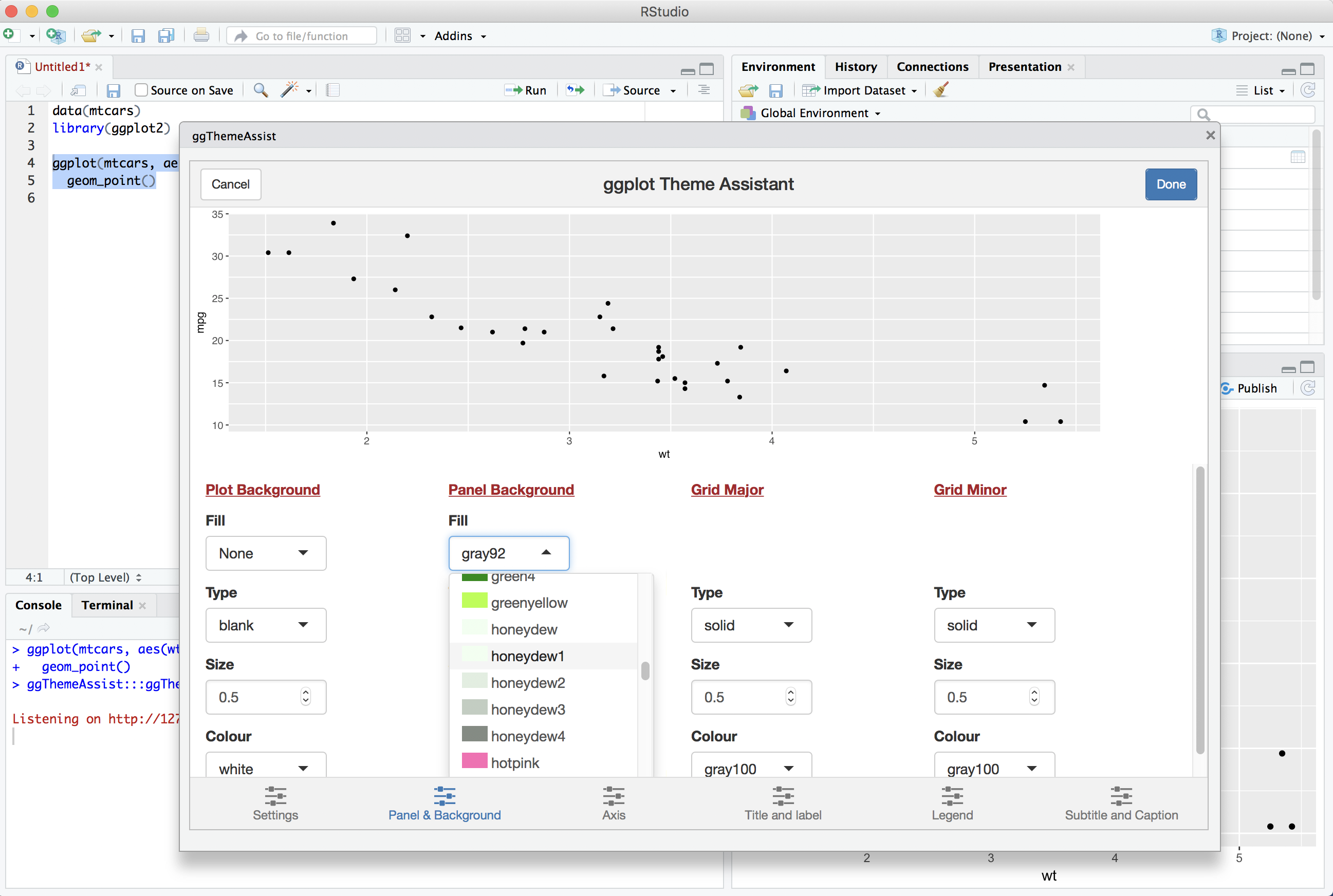
A graphical user interface (GUI) will appear that allows you to make changes to your plot, while showing you a preview of how those changes will affect the look of your visualization. You can make your changes and click the “Done” button to close the window and have ggThemeAssist add the appropriate code to your highlighted ggplot code.
For example, I might use ggThemeAssist to help me with a simple scatterplot based on the mtcars dataset. When I click on “ggplot Theme Assistant”, this is what I start with:
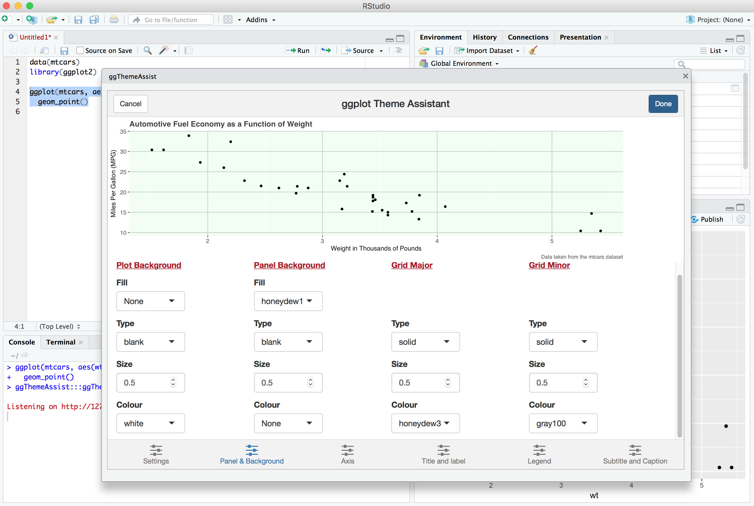
And after I tinker around a bit, I might end up with something like this:
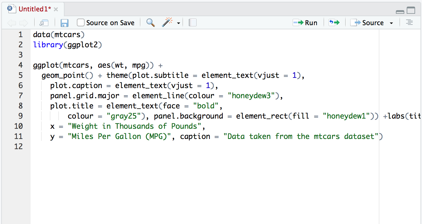
The ggThemeAssist package will amend my code, but sometimes not with really helpful spacing. I often tweak the generated code a bit to meet my own whitespace and readability standards. In my simple example, this is what I got:
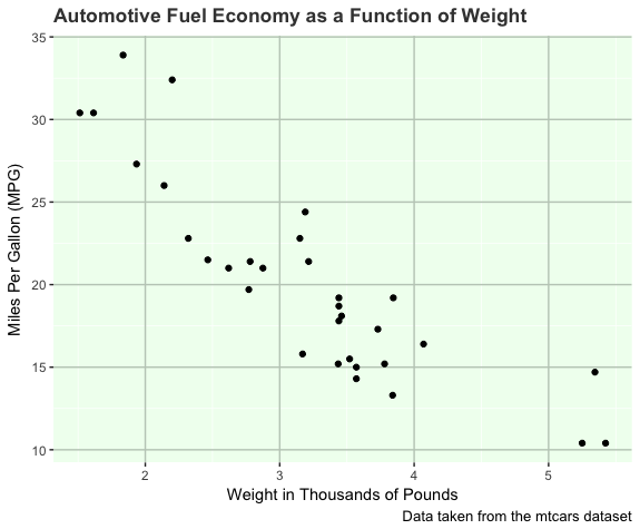
Finally, with your customized code ready to go, you can run the enriched ggplot code and see your customized graphic, ready to add to a poster or publication:
Want to try it? Simply install and load it:
install.packages("ggThemeAssist")
library(ggThemeAssist)